The 20 Worst Logos of 2020
2020 has been a minefield. It seems like you can't spend 5 minutes online without scrolling past a "new normal." But that hasn’t stopped companies from rebranding. In fact, we’ve actually seen a spike.
In a direct contract to increased rebrands, I've seen businesses close their doors, some for good; at a rate that we've never seen before. So it's not lost on me that rebranding is a privilege that some companies will never have the chance to experience.
I wanted to use my annual "worst" article as a set of cautionary tales and tips for businesses looking to change their look. With that in mind, let take a look at the 20 Worst Logos of 2020 in no particular order and see what we can learn from these rebrands.
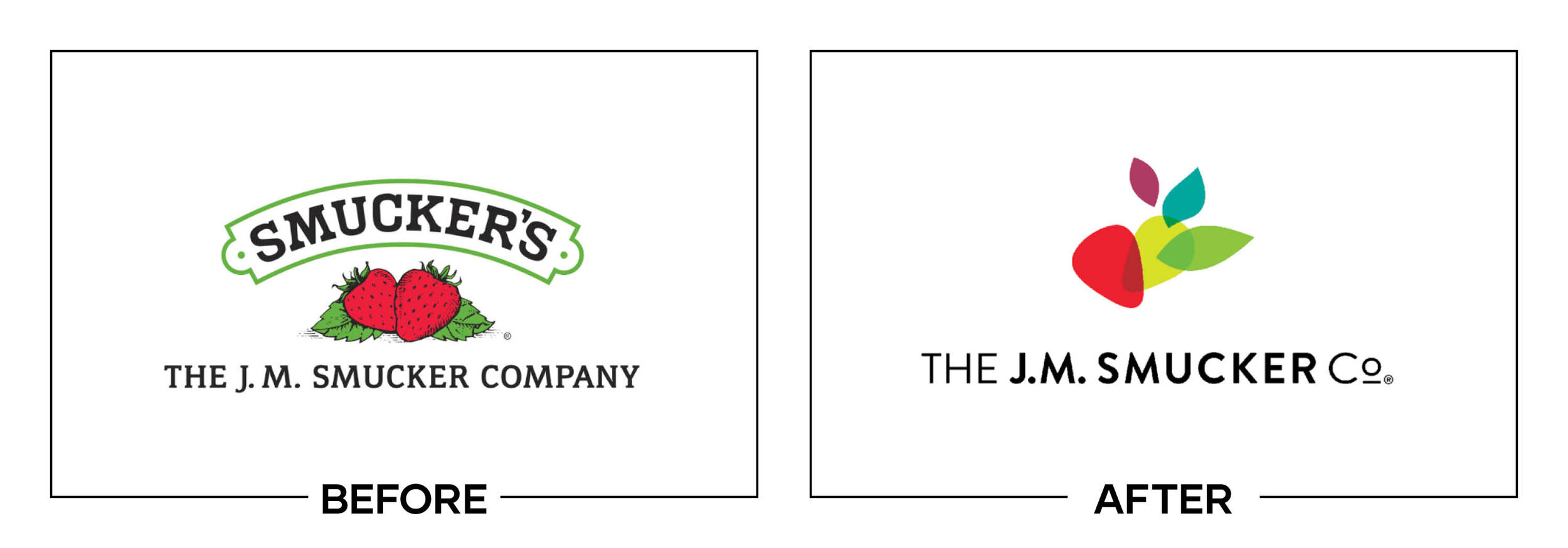
SMUCKERS
Why It Made The List:
This logo cannot be replicated in one color due to the overlapping transparencies.
The “after” is too modern for the "Mom and Pop" feel the company is known for.
As the brand repositions itself, a conglomerate feel loses the "Smucker's" name that made it famous.
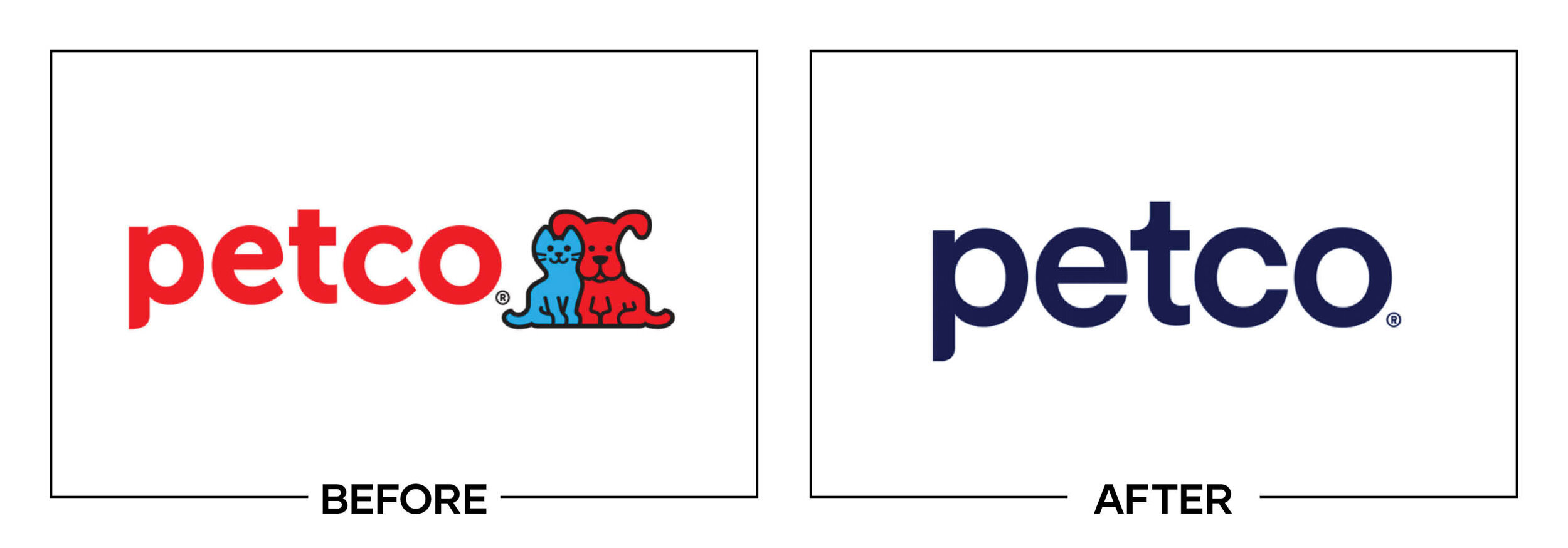
PETCO
Why It Made The List:
The brand voice is shifting to guilt-inducing verbiage to push healthier products.
While the updated typography is appreciated, the removal of the pets in the “after” is a total loss of brand personality.
Color shift, while the deep blue is meant to convey a clean, serious brand; it ditches the fun-loving attitude Petco had spent decades establishing.

DAVE & BUSTERS
Why It Made The List:
Legibility
Legibility
Legibility
Legibility
This “after” is illegible at a distance.
Blue on orange is an unflattering combination that vibrates.
The old logo was no award winner, but this new iteration is a step backward.
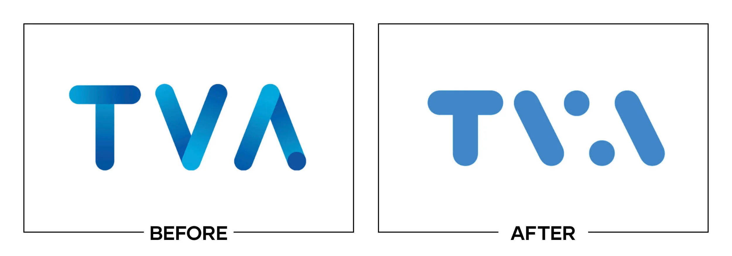
TVA
Why It Made The List:
From bland to blander. This logo doesn't tell the consumer what TVA is or does.
The "V" and the "A" in the “after” can be lost at a distance.
If you didn't know TVA was one of Quebec's largest TV networks. Both logos are a far cry from personifying a major new network.
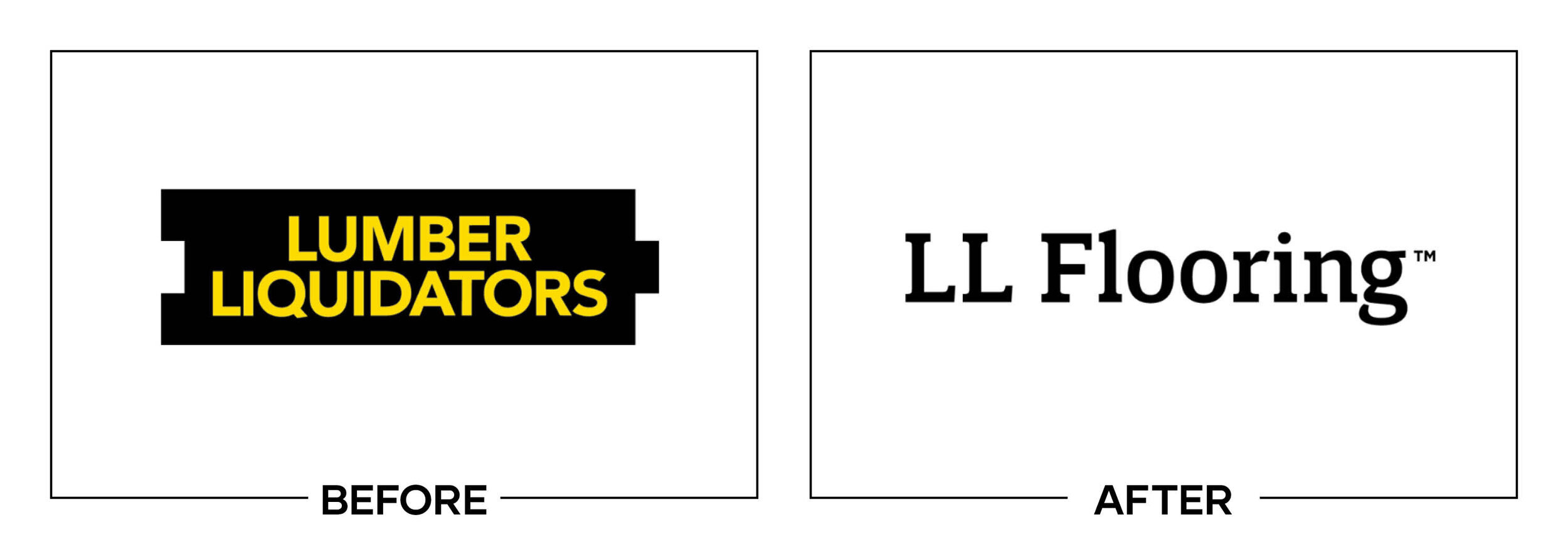
LUMBER LIQUIDATORS
Why It Made The List:
Corporate normality strikes again.
The “before” was a happy medium of iconography and legibility, the “after” lacks a voice.
There is no iconography. Rebranding as "LL Flooring" and shifting to flooring only with no supporting iconography leave us with a lackluster, unfinished product.
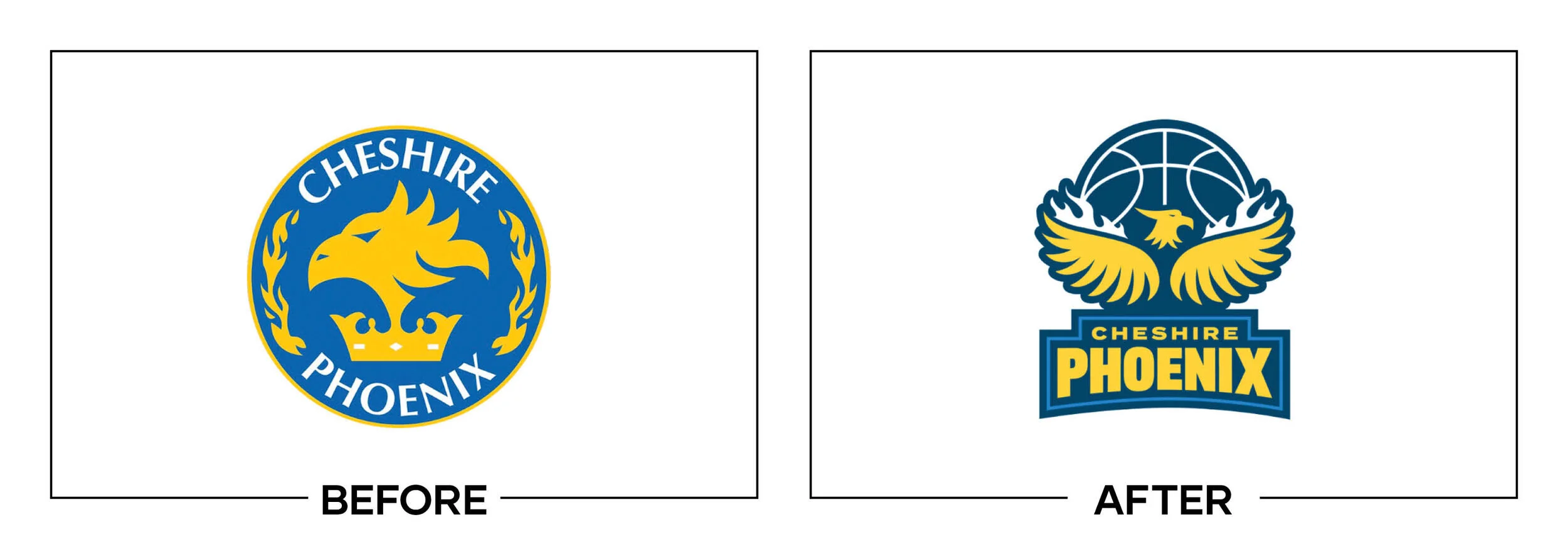
CHESIRE PHOENIX
Why It Made The List:
The "after" looks like a "before."
Both logos lack the ability to easily convert to a one-color version.
The logo feels a little minor league for a professional team.
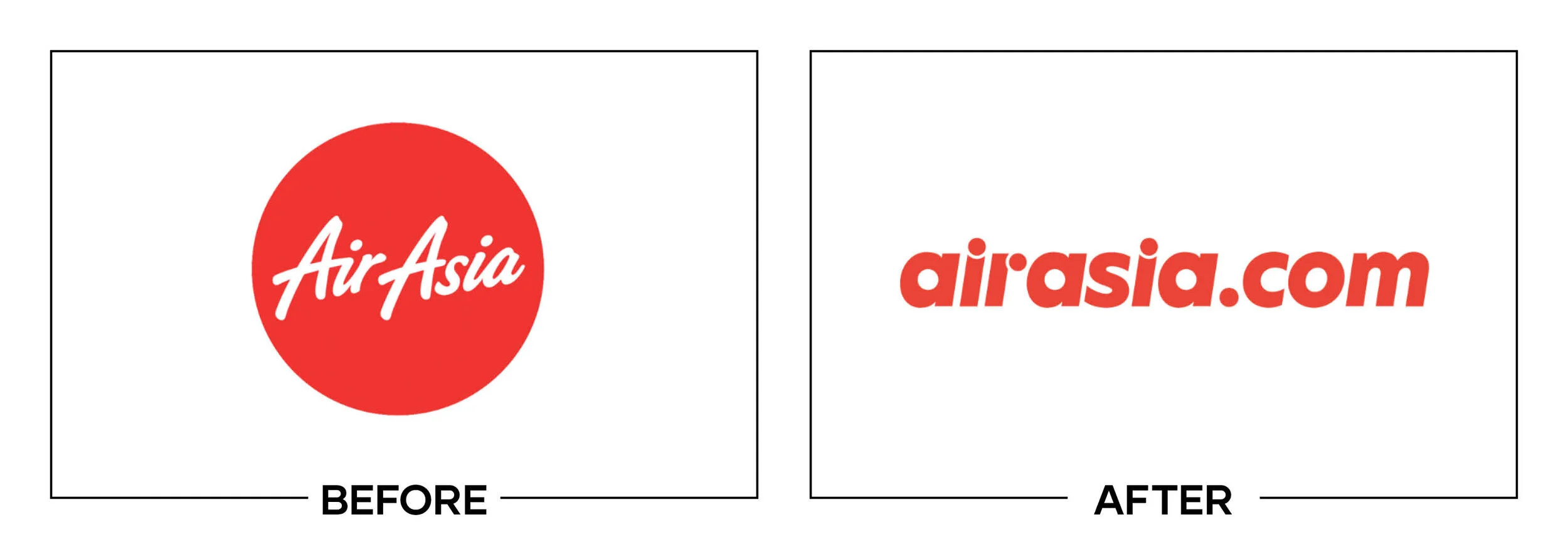
AIR ASIA
Why It Made The List:
A distinct loss of personality in the "after."
The circles in the "r" and the "i" are distracting.
Adding a ".com" to the company name feels dated.
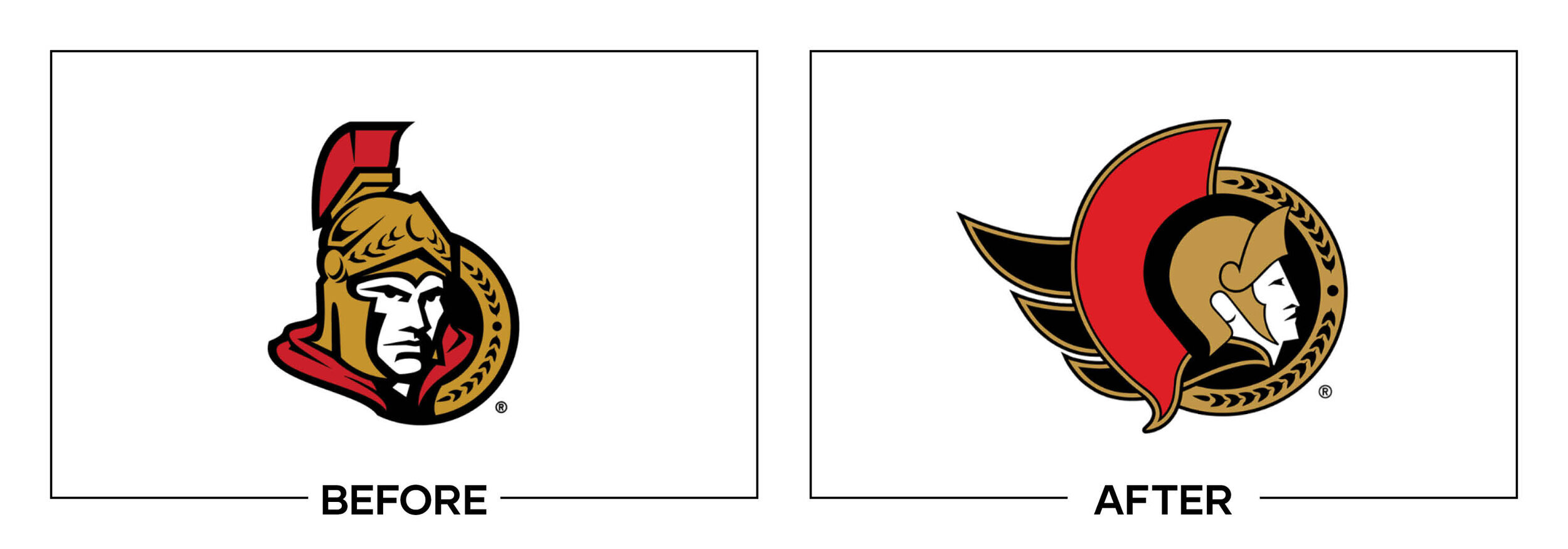
OTTAWA SENATORS
Why It Made The List:
While chasing history and reverting to a retro logo the Senators went back to a mark that is held back by the era it was created in.
As with several others on this list, the “after” does not scale properly and a one-color version does not exist.
The team should have taken a page from the Milwaukee Brewers who took a classic and modernized it.
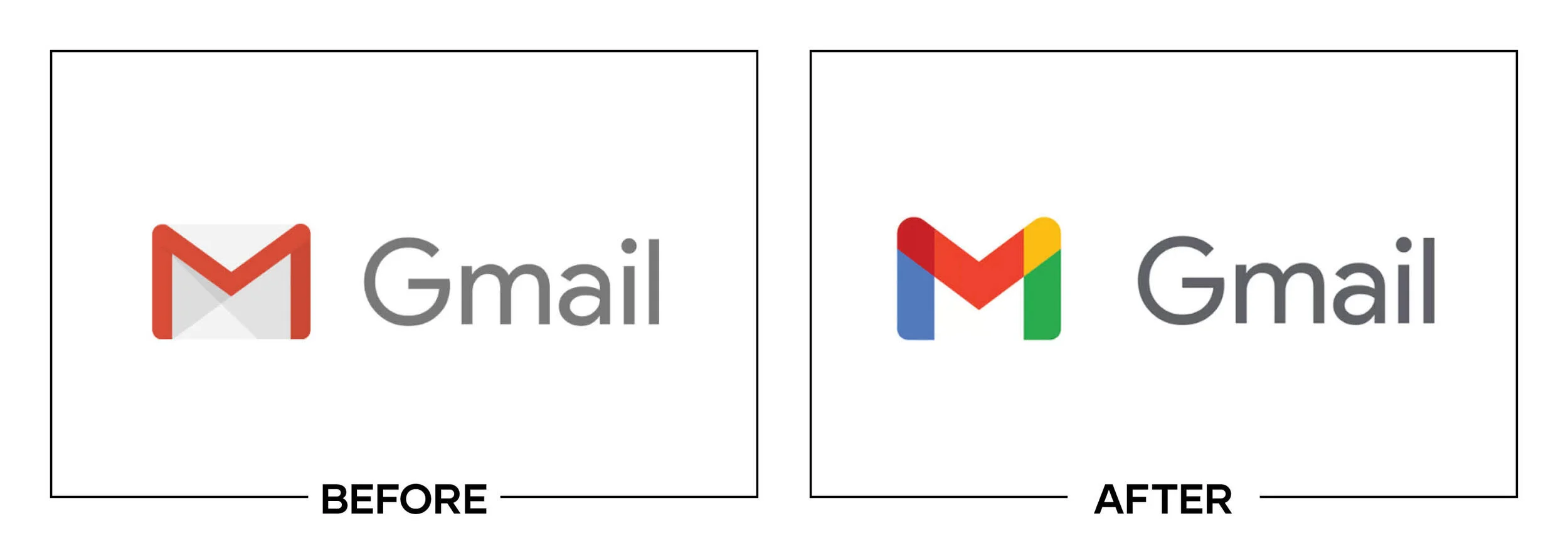
GMAIL
Why It Made The List:
Google attempted to align it's G-suite apps this year. In doing so, they muddied the waters making it hard for viewers to differentiate between apps.
Both the “before” and “after” lack a one-color version.
When clustered together in an app folder or on a home screen the app icons are too similar and cause frequent misclicks.
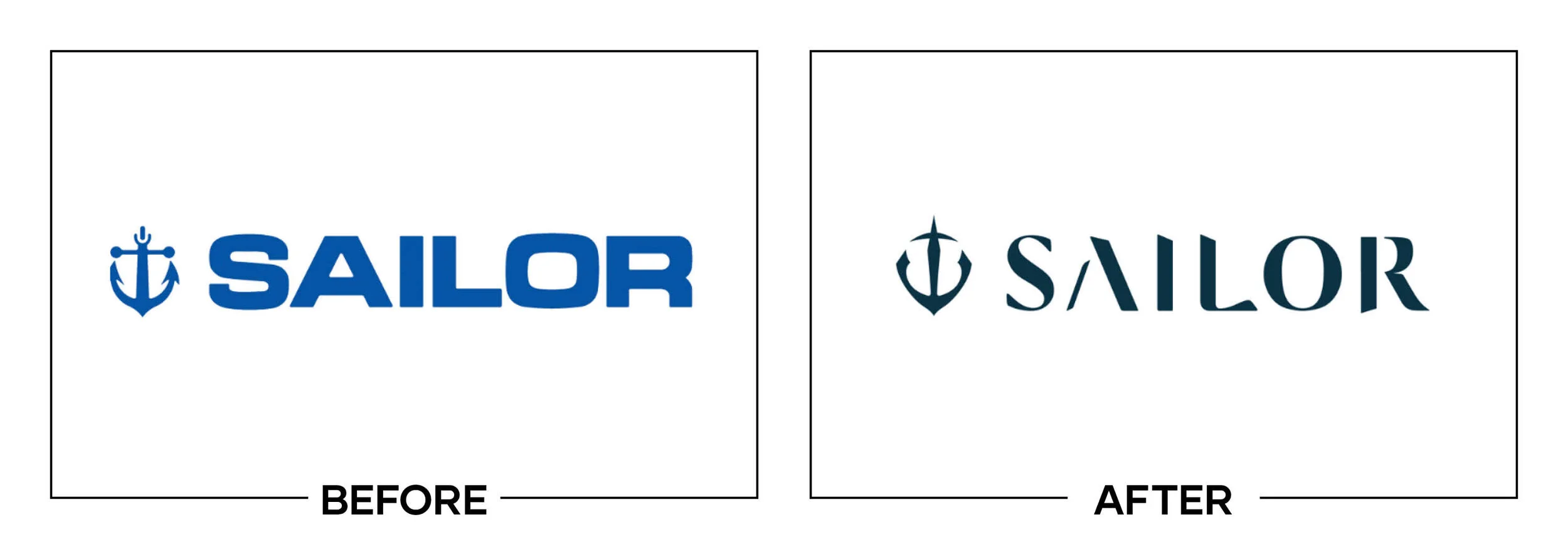
SAILOR
Why It Made The List:
A pen company trying to emulate calligraphy created a logo with reduced legibility. The “before” wasn't an award winner, but it was legible.
While beautiful, the mark fails to tell the user what the company is or does.
The "A" completely disappears at small scales.
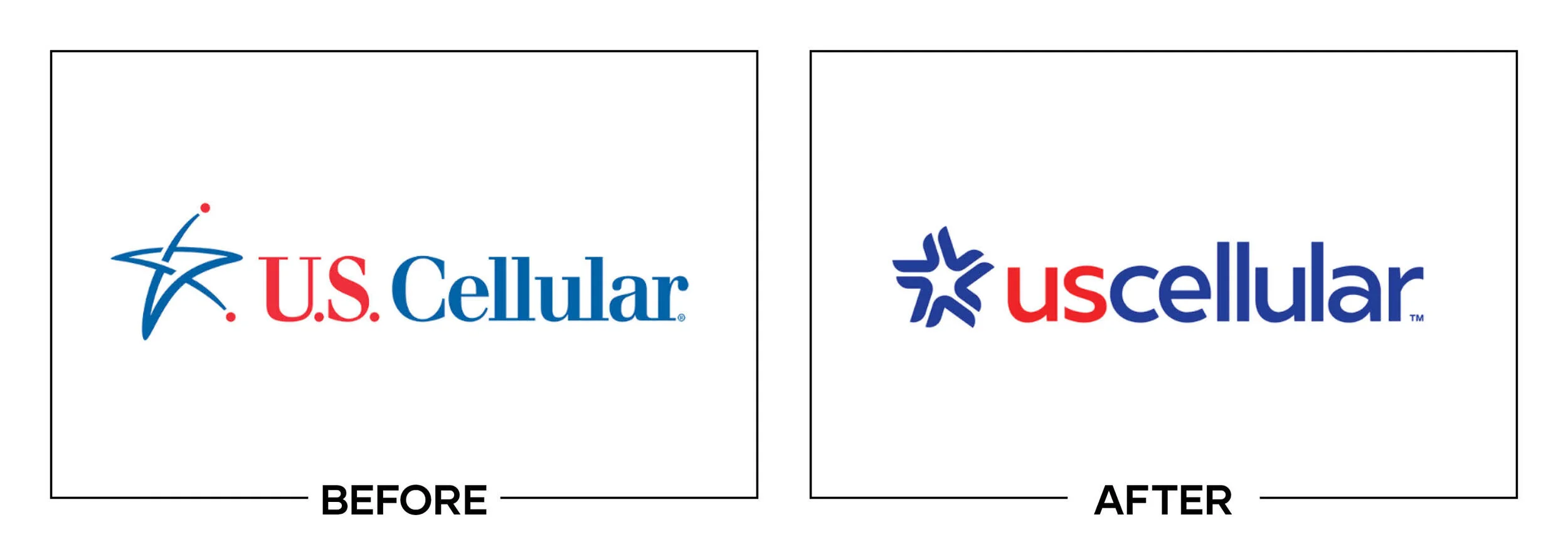
U.S. CELLULAR
Why It Made The List:
In a serious case of trying too hard, the “after” is an improvement, but it feels juvenile when compared to the rest of the market.
Reminiscent of a stock logo, you could replace the word "cellular" with any other industry and the logo would still work.
In an attempt to modernize and give the brand a serious tone, US Cellular created a generic solution.
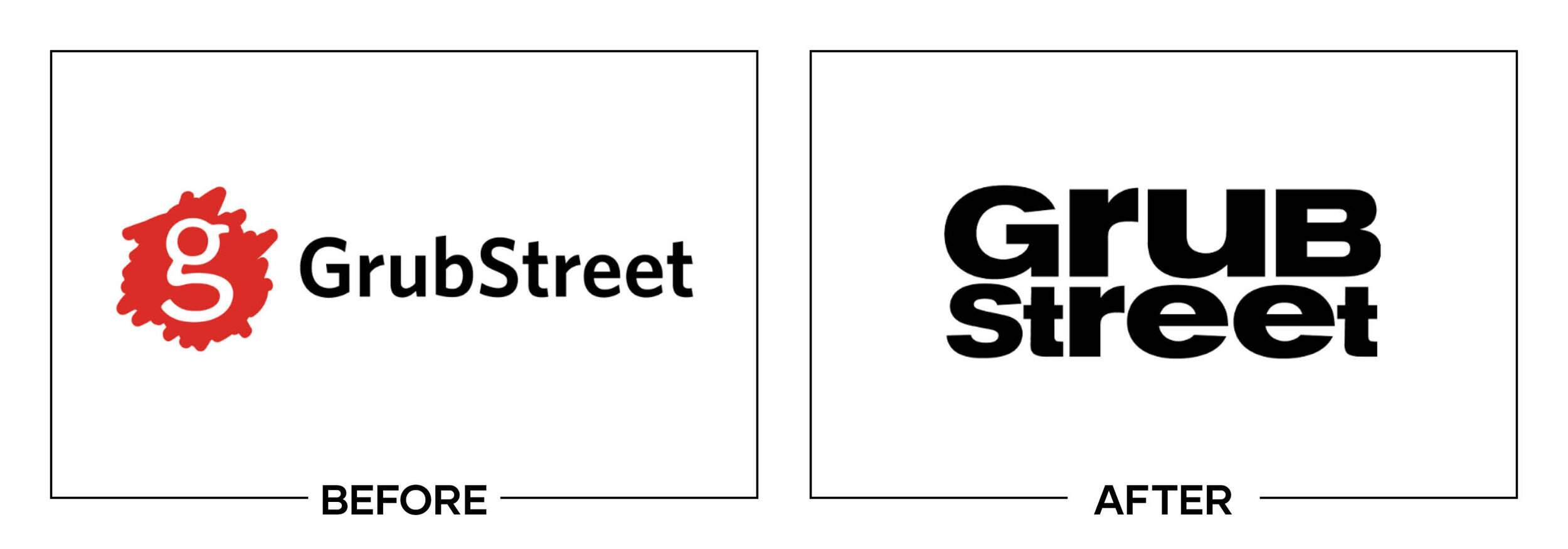
GRUB STREET
Why It Made The List:
We NEed tO SToP WrITIng LiKE ThIS.
It looks like this logo went back to the '90s when the distorted type trend was at its peak.
The "after" feels less like a professional brand and more like an experiment.
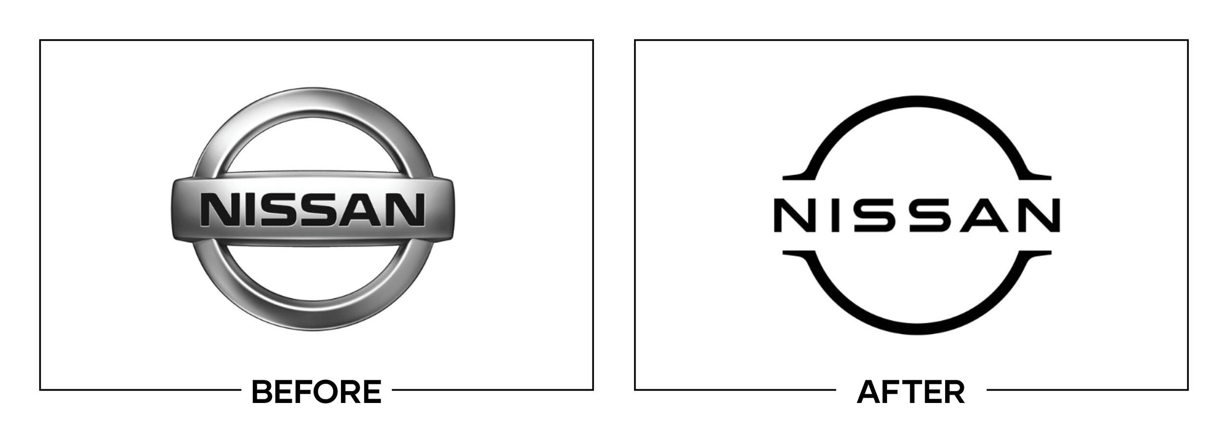
NISSAN
Why It Made The List:
Caught between a rock and a hard place this logo has the unfortunate luck of being one of the first of the major auto dealers to go two-dimensional.
Car companies typically have three-dimensional, intricate logos. These logos directly mirror the badges on the front and back of their vehicles. By switching to a two-dimensional logo, Nissan breaks from the trend, forcing them to rely on a middle ground.
On their new vehicles, they still have the old logo, creating split identities.
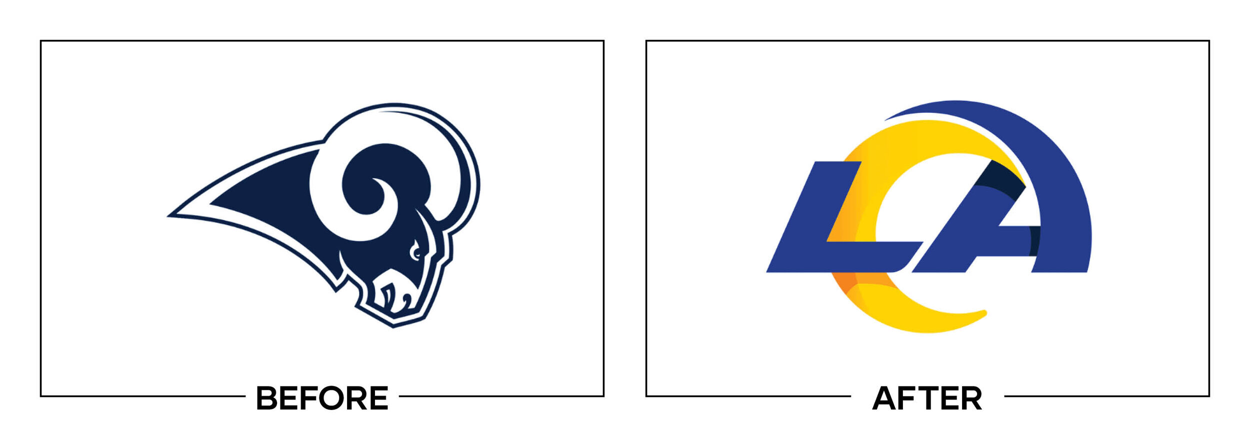
LOS ANGELES RAMS
Why It Made The List:
Due to overlapping gradients, a one-color version of its logo does not exist without editing or using an alternate version. Making merchandising impossible for the primary logo in some cases.
The logo feels very Californa but in all the wrong ways. Instead of feeling aggressive, it comes across as hyper-modern.
The gradient is nearly impossible to correctly replicate on stitched or screen printed apparel.
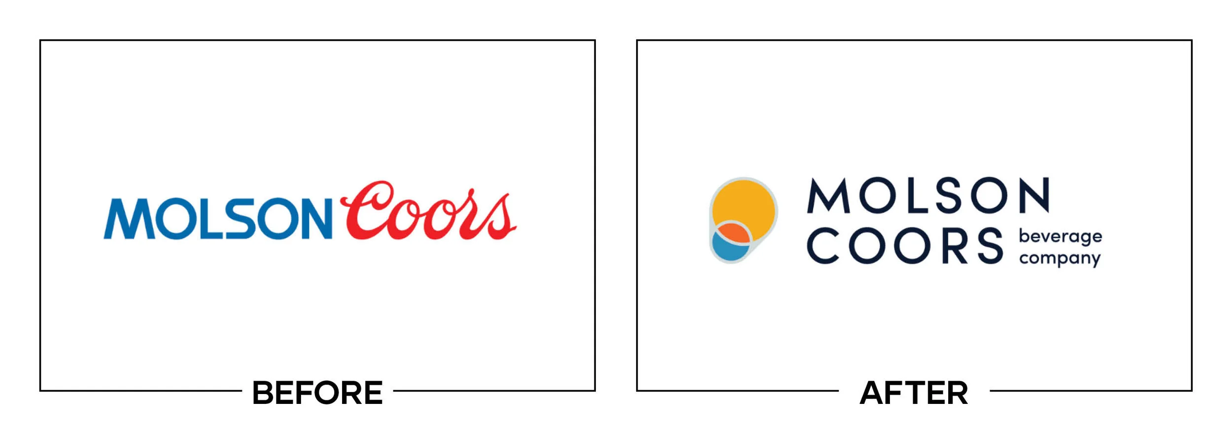
MOLSON COORS
Why It Made The List:
No way around it, the "after" has no soul and feels lifeless.
The logo's icon fails to tell me what the company is or does.
Ditching the iconic "Coors" script and at the least not modernizing it was a mistake.
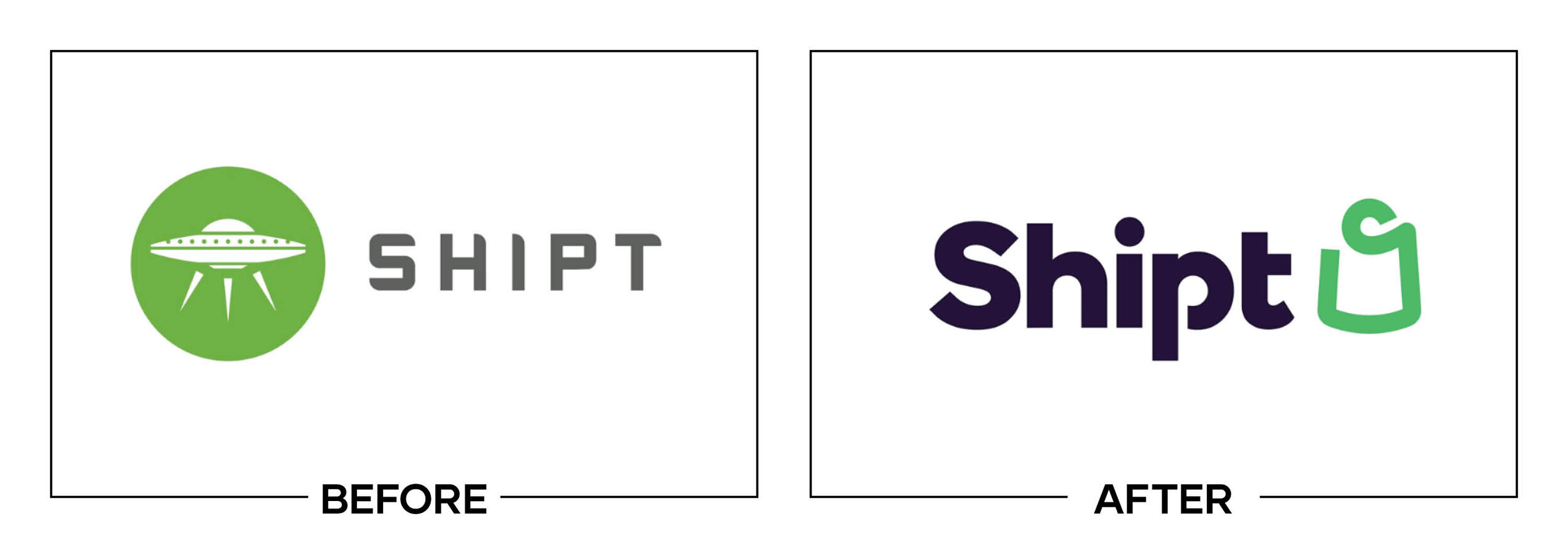
SHIPT
Why It Made The List:
Make no mistake, the "after" is not a bad logo, it is just a total disconnect from the brand's voice.
This is an example of a good start, but a bad finish. The wordmark is an upgrade, but ditching their namesake (the ship) is a bland solution.
It's nearly impossible to tell that the shopping bag is a shopping bag at some sizes.
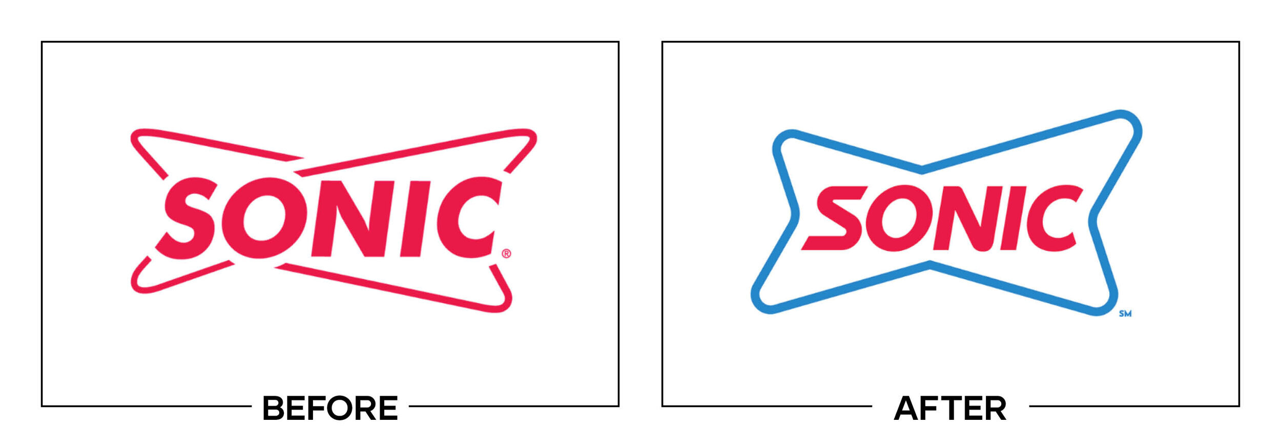
SONIC
Why It Made The List:
The "before" harbored two tailfins reminiscent of the tailfin on a classic car. The new mark merges these shapes into one to create a below-average logo.
The "S" doesn't fit with the rest of the logo and feels jarringly out of place.
The "before" felt fun and inviting, the "after" feels modern in all the wrong ways for a brand build on invoking the classic drive-in feel.
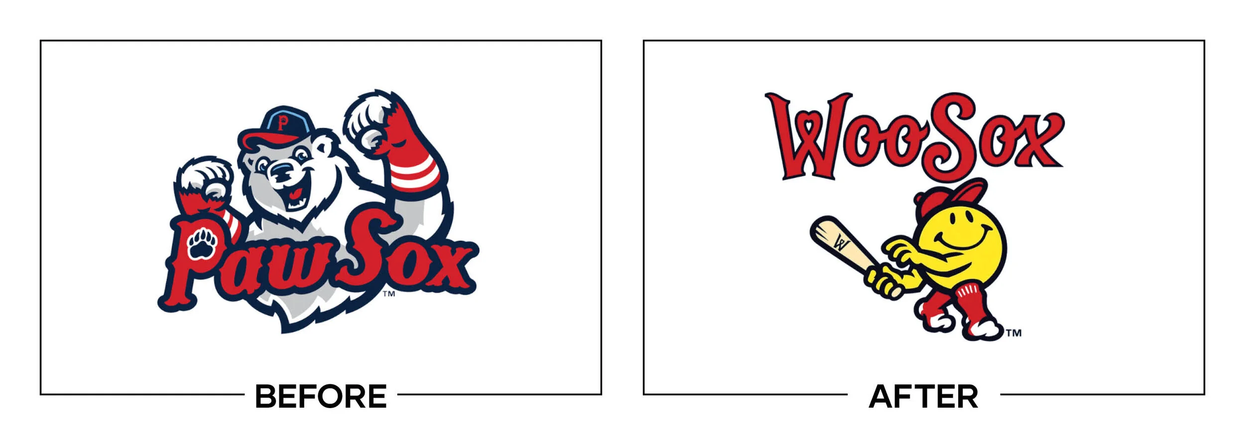
WOO SOX
Why It Made The List:
Don't mess with perfection. Minor league team mascots are meant to be unique, weird, and entertaining. The new mascot is the definition of generic.
In the “after” the "Woo Sox " lettering feels slightly off; with odd curves, spacing, and warps at random intervals.
The team is moving to a new stadium called Polar Park, ditching the polar bear probably wasn't the best call.
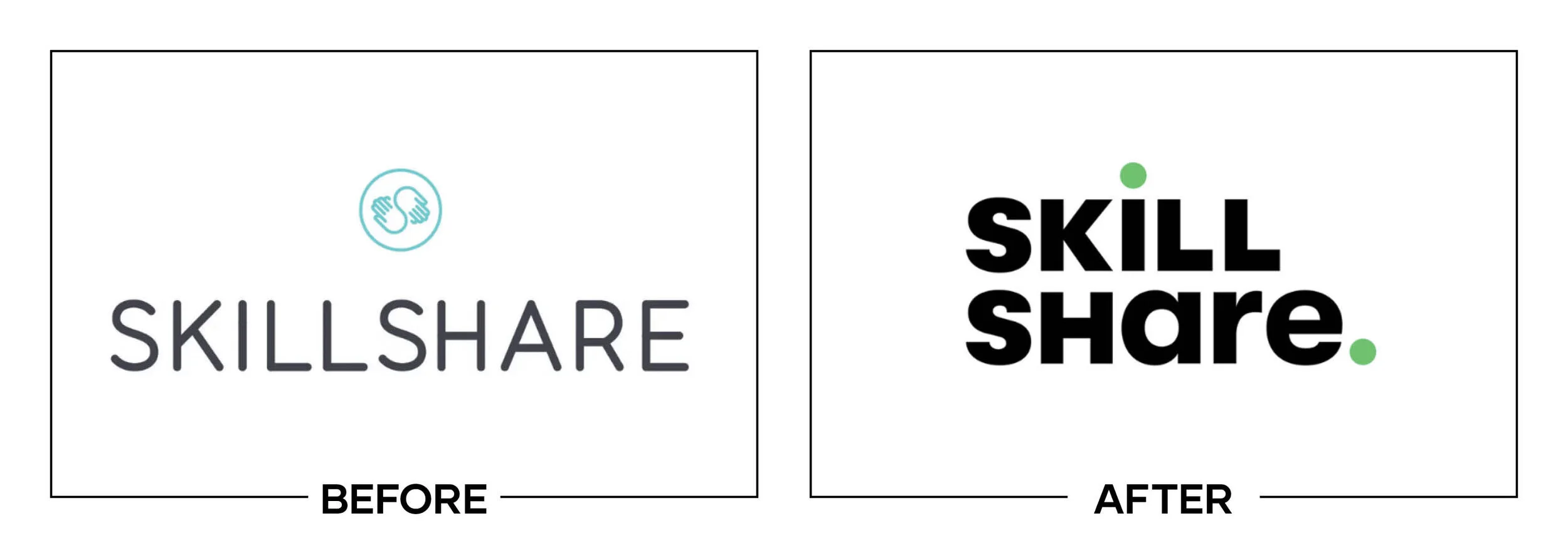
SKILLSHARE
Why It Made The List:
A loss of personality. The old logo felt authoritative and informational. The new mark seems like it's trying to blend in with the cool kids.
There is bland, then there is this rebrand. The mark feels lazy, nothing makes it unique.
As a species, we need to stop mixing capitalization consistencies in logos. randomly going lowercase for "are" just feels wrong.
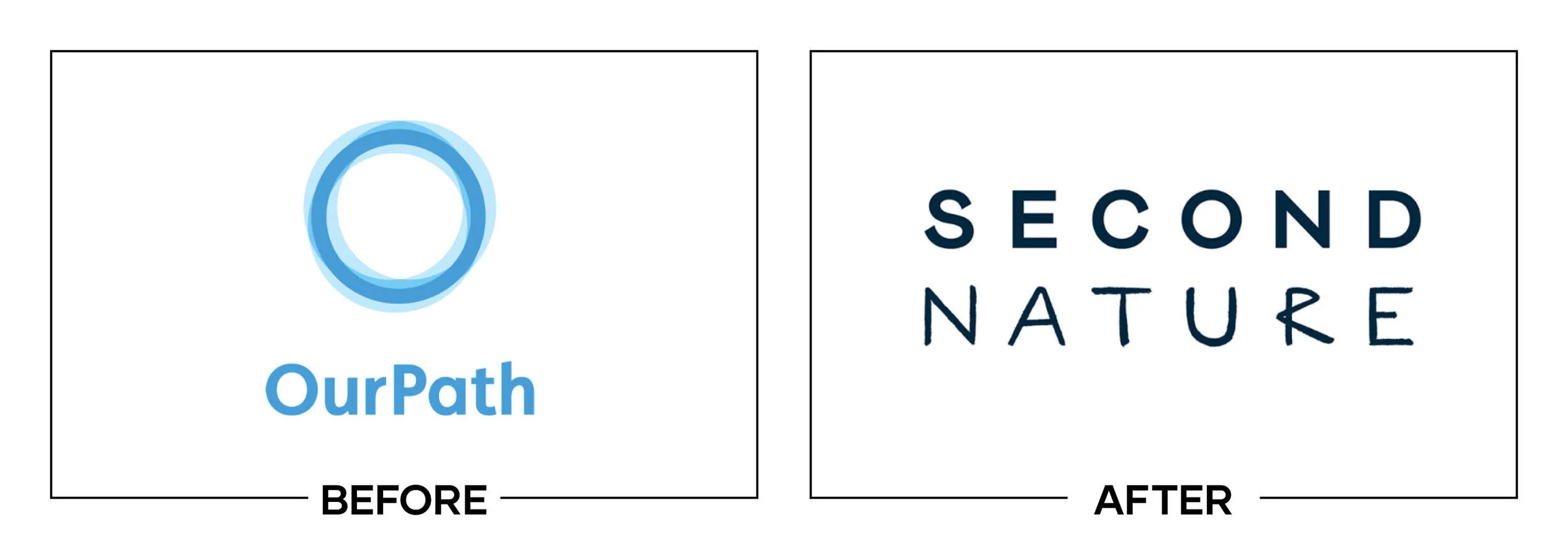
SECOND NATURE
Why It Made The List:
A journey from bad to worse. Both the "before" and the "after" don't tell the customer what the brand does. It feels like the brand is in the middle of an identity crisis.
The "R" in the "after" feels like it's from a different font.
The "after" lacks any sort of creativity, leaving what should be a fun, engaging brand feeling dull.

I'll be honest, this is a lot to take in and it all feels negative, but that's what this article is. It's a short case study into what doesn't work. Let's look at the silver lining, not every one of these logos is all bad. Most of these logos are a small tweak away from being a creative masterpiece; they just need a little more love, and in the cases of logos that are too far gone, it's an opportunity to continue sharpening the sword.
The reason that I write my best and worst articles every year is to provide perspective for companies considering a rebrand. The wonderful thing about creativity is that it is subjective. You don't have to agree with my thoughts, but I ask that you take them into consideration. I hope that they work as conversation starters to help guide you in your own rebrand.
Does your brand need a new logo? Let’s talk about creating a one-of-a-kind logo for your brand!.