The 20 Best Logos of 2020

In my "worst" article I attempted to shine a light on some of the common missteps brands make when going through a rebrand. In this article, I'd like to tip my cap to the brands ending this decade on a good note.
It's been a difficult year across the board, and it's going to be a long time before we settle back into something that resembles a pre-pandemic world. It is my humble opinion that these logos provide us a chance to better ourselves through design. They are wonderful examples of what a modern logo should be, and I'm so excited to share what we can learn from these brands.
That said, let's dig into the 20 Best Logos of 2020 in no particular order.

ADLER PLANETARIUM
Why It Made The List:
Not just the logo, but the brand voice and imagery appeal to the planetarium's primary visitor base; children.
Open and inviting, the "after" feels less like a posh museum and more like the interactive, educational space it truly is.
In an industry filled with intricate, high-end, or generally refined logos, this is a welcome breather.

WOMEN’S SPORTS FOUNDATION
Why It Made The List:
A stark contrast in the "before" and "after" is a good example of how dramatically a rebrand can guide a company.
The retro-inspired mono weight lettering is carried out through the foundation's website iconography. It's a beautifully designed matching set.
A strong logo for a company on a mission. 10/10

COLORADO COLLEGE
Why It Made The List:
Like a caterpillar into a butterfly, this is one of the most drastic transformations I've seen in years. The “after” feels hopeful, especially in their release video.
Clean linework, beautiful use of negative space, and a nod to Colorado all packed into one logo make the icon an instant classic.
Instead of calling it a day with the icon, a custom font was commissioned for this project. With a bold base and sharp angles pulling from the Tiger’s teeth, it has a distinct and powerful feel.

COPPER
Why It Made The List:
The "before" felt incomplete with the negative space in the "o". By ditching it and converting the "c" into a cent symbol we now know this is a financial company.
Angles from the cent symbol are included in the lettering for wonderful continuity.
The "after" feels like a corporate brand in all the right ways, while the "before" felt like a mining company or rugged apparel brand.
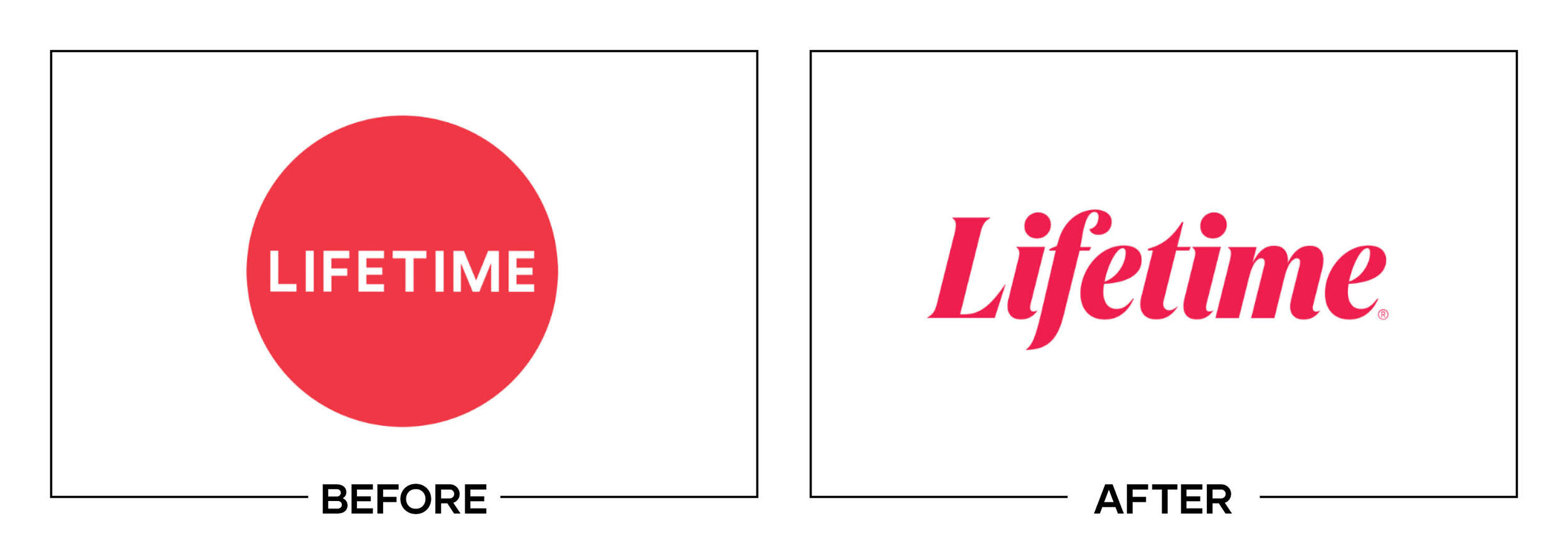
LIFETIME
Why It Made The List:
Legibility and beauty, a combination that is often taken for granted in a script or handletter-esque font.
Lifetime is known for emotional movies and stories that captivate. The "after" encompasses that emotion while the "before" felt like a generic, soulless logo.
A brand that had lost its identity has found it again. Lifetime had undergone four rebrands in the last five years before settling on this logo.

POPEYES
Why It Made The List:
It's not perfect, and that's okay! This "after" is a clear improvement in terms of legibility and reuse. While I disagree with the lowercase "e" overall this chain is moving in the right direction.
In addition to a new logo, Popeye's has transformed every bit of the company's visual branding. This is a full buy-in and not just a quick fix.
Sometimes the smallest changes are the best ones. By shifting their orange to a lighter hue they have increased visibility and legibility. The mark feels fresh and light compared to the old orange.

IRON CITY BEER
Why It Made The List:
The rebrand was accompanied by some of the best looking alcoholic packaging on the market. I'm gushing over every bit of Iron City Beer’s new look!
Strong retro-inspired lettering with just a hint of playfulness creates a unique brand font that emulates the tough guy nature of Pittsburgh's metalworkers.
The colors in the "after" feel welcoming and bold. A far cry from an industry engrained in blues and browns.

LITTLE LEAGUE
Why It Made The List:
You can read the logo now! The brand name was buried in the "before" to the point where I imagine it was illegible on small patchwork often seen on jerseys.
While brand pillars are important, taglines on logos are becoming a thing of the past and the choice to exclude them is a welcomed one.
By shifting the brand colors to a darker hue, Little League has invoked a sense of professionalism and authority that the “before” was lacking.
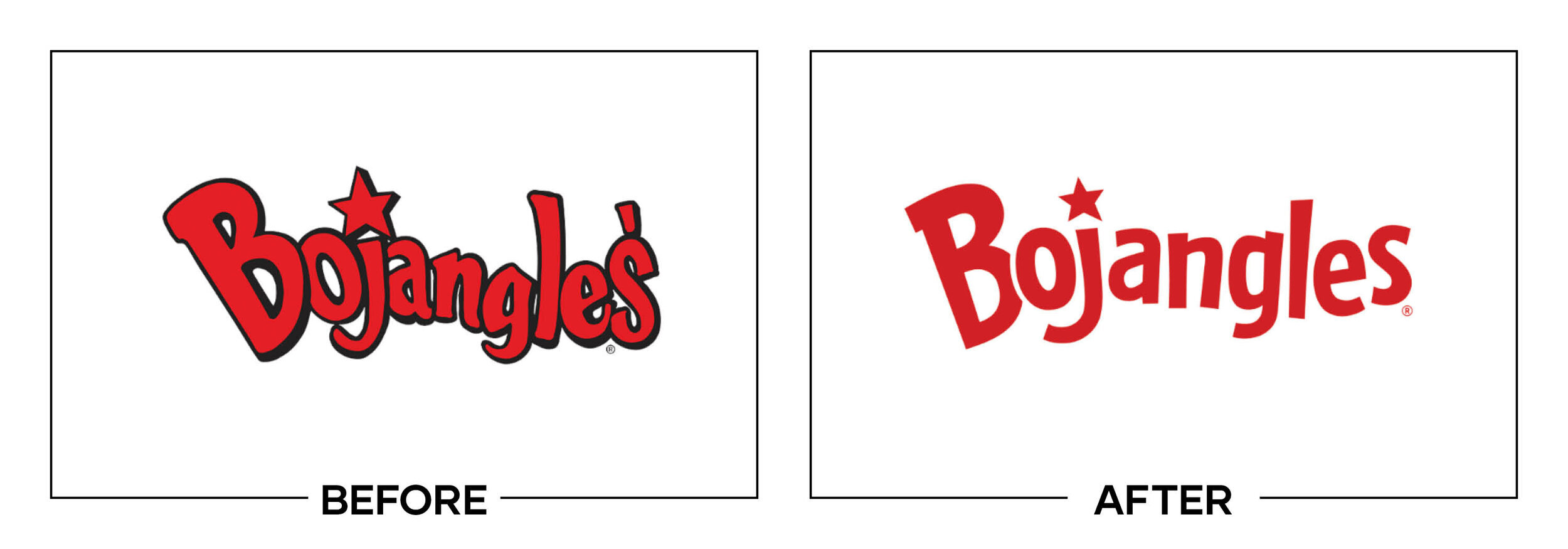
BOJANGLES
Why It Made The List:
Not the only chicken joint rebrand on this list and it wins and loses in the exact same spots with a more approachable “after”.
Just like Popeye's, this isn't a perfect logo. But shifting in this new direction is a win and the brand's visual identity as a whole has improved.
So why did it make the list if it's just a clone of Popeye's rebrand? In a word? Merchandising. They know how to make their logo work for them.

AVON
Why It Made The List:
Remember the story of the three bears? "Too Hot.", "Too Cold.", "Juuuuuuust Right." In the past three years, Avon has been dialing in their logo and brand voice and I think they've finally nailed it after going to extremes in two opposite directions.
A tasteful gradient that is used across supporting imagery to embody movement.
With a different approach to a traditionally refined industry, this bold lettering feels like a fresh take on what a beauty brand can be.

TECATE
Why It Made The List:
Improved hierarchy combined with engaging brand assets creates an "after" that soars over it's "before".
The little details count. The logo straightened bird icon allows for beautiful symmetry showcased here in a can's pull tab.
Ditching the faux-stroke on the "before" allows cleaner one-color applications.

CASEY’S
Why It Made The List:
The "before" felt like a patchwork of several logos. By aligning the brand under a single name and visual identity we're greeted with a visually striking, cohesive brand in the "after"
Casey's no longer feels like a beaten-up corner store as it transitions to a modern gas station.
Let's talk about the rooster on the weather vein. Talk about a come up. It went from barely recognizable to one of the most prominent pieces of the mark.

ATLANTA BREWING CO.
Why It Made The List:
This logo makes me thirsty for more. Beautiful retro lettering in the "after" that ditches the ugly, textured "before" lettering is what a rebrand should be.
Seriously. Look at the lettering. Too many companies go for bland typography that is an afterthought. This custom solution is engaging and the "t" is a work of art.
Okay, okay, okay... I'll stop blabbing about the lettering long enough to talk about the name swap. Switching from a hyper-local name to a broader and more inviting name, then invoking the Atlanta Braves colors is a smart play. Catering to your base is a home run. Get it? It's a double baseball pun.

FISCHER-PRICE
Why It Made The List:
The most subtle rebrand on this list, fisher-price went back to its roots with a muted orange-red tone, lowercase lettering, and sharp edges. This logo is embracing the company’s retro vibes and it works.
A brand that isn't known for high tech toys, the aforementioned retro look feels like the perfect solution to stick out on the shelf in a space crowded by bright color palettes.
A secondary, circular logo brings the identity into the 21st century with a mark that crops easily for social.

FIELD ROAST
Why It Made The List:
Times are-a-changing. Ditching the way too busy "before" levels the playing field in a marketspace crowded with sharp-looking competitors.
Would you just look at the cute little fork-wheat icon? Just look at it. I would fight for it and protect it.
Legibility is the biggest winner here. The "after" easily breaks down into primary, secondary, and tertiary marks to adapt to any situation.
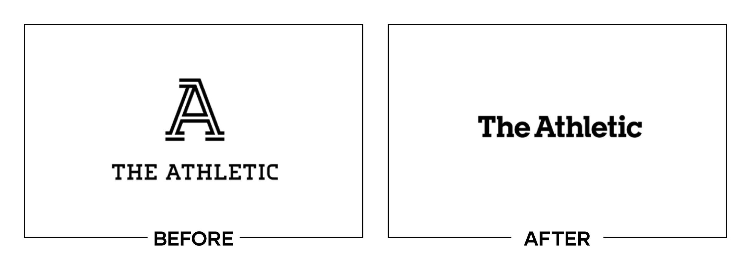
THE ATHLETIC
Why It Made The List:
The "A" in the "before" maybe one of the worst icons in literary history. It felt like a total disconnect from the brand's audience.
On the other side of the coin, the "after" feels like a respectable publication with some experience under its wings similar to wordmarks of The Atlantic or The New York Times.
Clean and to the point. Less is more when it comes to design and the "after" nails it.

HELLO FRESH
Why It Made The List:
Say hello to a modern logo that can be easily converted to one color. This solves a problem the company had run into with spot color printing on boxes.
Playful tweaks in the "H" and "R" feel, well, fresh.
The gradient on the tips of the lime is a wonderful way to keep it from feeling like one color clipart.

AFTERPAY
Why It Made The List:
What were the arrows in the "before" trying to convey? The new icon tells the story of an exchange and lets me know what the company does.
The brand's secondary color palette brings in a soft mint color that feels inviting.
Credibility for a creditor. The all-black "after" primary logo conveys a sense of professionalism that the "before" lacked.

TAMPA BAY 10 NEWS
Why It Made The List:
Look at this brand reveal video. This is a visually interesting channel branding that beats anything else in space at the moment. It’s beautiful.
This might be my favorite "after" of all time. I'm sure this was a difficult pitch to the client. In a space with such a defined style, this was a risk. Take this as a lesson in openness, the fact that a corporation was willing to go in such a bold direction is a masterclass on trusting your design team.
A balancing act of retro and modern this mark has everything you could hope for in a rebrand. What a bold take on a rebrand. I give it a 10 out of 10.

KING ARTHUR FLOUR
Why It Made The List:
Similar to the Field Roast rebrand above the "before" was so busy it was only hurting itself. Additionally, by harboring the name “King Arthur Flour” instead of “King Arthur Baking Company” it was severely limiting its market, as the brand offers several product lines.
Weaving a wheat head into the linework of the crown is a wonderful compromise between telling me about the brand’s history and showing me what service it offers.
Lots of rebrands include ESTD. these are typically dates from the past decade or two. Embracing the brand's founding date is the perfect crown atop this logo. Would you rather buy from the brand that's been around ten years or literal centuries?

Here we are, the end. He made it through the 20 best logos of 2020 and now you're looking for a recap. But this year there isn't going to be one. This year I want you to reflect on these logos and then reflect on your logo.
Does your brand need a new logo? Let’s talk about creating a one-of-a-kind logo for your brand!