The 10 Best Logos of 2017

Sometimes, they just nail it. Whether its a full on rebrand or a simple tweak 2017 was filled with amazing design!
We were gifted with amazing resources, new and exciting tools, and fresh platforms to showcase everything on. Oh yeah, some breathtaking redesign as well!
Listed below are my top ten contenders (in alphabetical order) for the best design choices of 2017. Note that I'm not saying logos here. While we'll be critiquing the new looks, I want to focus on how in some cases the design around the logo aided in the rebrand being a success.

AUTOTRADER
Just like a tuneup keeps your car running smoothly, a rebrand can benefit a company the same way. Instead of starting from scratch AutoTrader modernized their logo, tweaked its color palette, and went with a more legible font; taking this logo from an airline knock-off to a stand out brand!

CANADA SNOWBOARD
Can we just take a second to admire the after portion of this rebrand? A subtle upwards arrow accented with the country's ever-present maple leaf took this average before and turned it into one of the most highly praised rebrands of the year. Kudos to the entire design team for creating such an amazing piece!

CARL'S JR. / HARDEE'S
When you think fast food a few icons come to mind. Golden arches, a purple bell, and that red, white, and blue colonel. Depending on what part of the country you live in Hardee's and Carl's Jr. are right up there on the Mount Rushmore of fast food chains. That's why such a refreshing and modern rebrand was amazing. Dropping the drop shadows, smiley faces, and cheesy effects; these sister brands grew up overnight. It remains to be seen if the rebrand will actually affect the over the top and sexualized commercials.
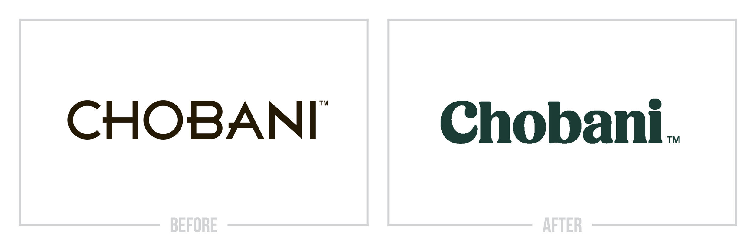
CHOBANI
We have a winner! My personal favorite rebrand in years shows how big of a difference color and typography can make. Ditching the suit and tie look Chobani crafted a custom font and paired it with an all-natural olive green. Products now stand out like light in a dark room on shelves and the company has combined the rebrand with refreshing transparency that often isn't found in the corporate world.

HYUNDAI
As far as rebrands go this is the least creative on the list, but that doesn't make it the least effective. In a crowded market filled with detailed logos, badges, and campaigns; Hyundai ditched the metal look every other company embraces and selected a relaxing navy blue that really compliments their vehicles and brings a calming feel to one of the most nerve-racking purchases you make.

LITTLE WOLF
Compared to the other wolf on this list you'd think Little Wolf would be out of its league here. Not even close. Little Wolf is the example I show clients when they ask how a rebrand can affect their brand and connect with customers new and old. The designer poured charm and authenticity into the rebrand leaving us with a standout logo in a market saturated with corporate, uninspiring marks.

MINNESOTA TIMBERWOLVES
Let's face it. Most team logos are boring and they shouldn't be. It wasn't always this way, and fortunately, sports teams are beginning to put more effort into them in light of a few recent successes and failures. In dramatic fashion, the Timberwolves went from one of the most dated logos in all of sports to one of the most effective and unique. Ditching the old color palette, crafting a font with unique touches like an "A" without its crossbar, and revamping all print and digital content creates a championship worthy mark.

NASCAR
The team at NASCAR should be taking a victory lap after this rebrand! Sticking with the theme of bringing your past into the 21st century they flipped the straight out of the 80's before logo and forged a familiar, but exciting after logo. While honoring its heritage this rebrand truly ran laps around the competition!

TINDER
Despite your personal views of the millennial dating website, Tinder has become an ever-popular staple for young adults looking for love. Ditching the burnt orange and even the text for a new flame and a modern gradient seems like a risky move. But when your brand becomes integrated into a consumer's daily life you get to call the shots. At risk of sounding over-the-top, I believe that Tinder's after logo will stand the test of time and leave its stamp as one of the most recognizable marks of the decade.

YOUTUBE
Taking the "tube" out of YouTube was one of the best decisions the company has made in years. A key example of rebranding after negative PR, YouTube looked to move past its conflict with content creators and usher in a new era. With a very (and I mean very) subtle tweak to the font and the addition of the now iconic play button, this rebrand isn't flashy. But, it doesn't need to be!

Thanks for reading my annual Best Logos of the Year article. It really means a lot to me!
Does your brand need a new logo? Let’s talk about creating a one-of-a-kind logo for your brand!