The 10 Best Logos of 2019

As the final leg of the holiday season approaches, we are greeted with a period of reflection. The internet is crowded with best of the decade lists, opinion articles, and clickbait slide shows that show you more advertisements than content. So, naturally. I had to throw my hat into the ring.
I wanted to shout out the brands who genuinely cared about their look and either took risks that paid off or reestablished their brand in a completely new way.
Each year I rebrand logos for several customers; some of them have found me for the first time while others have been working for me for almost a decade. But no matter where they're coming from or how we're doing the rebrand, the hardest part for the customer is always taking the leap and doing a rebrand in the first place.
These companies pulled the trigger and tried something different. In the case of some of the marks below, it's a minor tweak, while others have entirely redefined their look. Some might say this is scoffing at tradition or making a change just to make a change. I would profoundly disagree. In an age where we are continually competing to stand out, especially in the digital world, taking time to properly define your look is exactly what some companies need I'll touch on it further below. Still, I genuinely believe that deciding what some might call a creative risk is slowly becoming a necessary steppingstone for the success of any company.

SLACK
We'll start with Slack. This communication hub is a favorite of large offices and creatives all over the world. It's ability to integrate with so many other tools, and companies make it an excellent platform for communication. Ditching the opaque logo and moving to a sharp, bold, and flat look brought this beloved company further into the spotlight.

LAY’S
While this could easily be seen as a lazy rehashing of an old mark, it is so much more than that. Ignoring the countless benefits from a printing perspective, the new logo is fine-tuned for the digital world. Similar to what PepsiCo did years ago, a slight modification breathes new life into an iconic brand.

DISH
With cable and satellite companies beginning to fret and sweat from the competition of streaming platforms, it is more important than ever for them to remain not only socially relevant but useful. This year Dish did an overhaul not only to their mark but to their entire user interface, integrating their channel guide with valuable tools and even direct links to their streaming competitors, making it a seamless transition between cable and on-demand. Additionally, creating an on the go version of their service that customers can stream instantly put them back in the race. This boldfaced mark communicates this by ditching the serifs and conveying this smooth transition.

YAHOO!
No stranger to rebranding since it was founded in 1995 there have been several different versions of the Yahoo! logo. When taking a moment to look through the different styles and colors, it has generally been a boring rehash of the same thing. This year they ditched the chaotic lettering of the past and unified their brand with a bright, digital purple and a bold Sans-Serif font. When looking at some of Yahoo!'s direct competitors, you can see why they did what they did, and I wholeheartedly welcome a company embracing their competitors both visually and editorially as the rebrand brought an update for the website and the content that they provide.

WARNER BROS.
I feel that I may get some flack for this pick because the classic Warner Bros. logo is cinematically historic. For decades it has adorned the opening of films and has been a fan favorite. That's why some folks were taken back by this rebrand. "If it ain't broke, don't fix it." Right? While the old mark is undoubtedly iconic, as we transition into a filmmaking revolution filled with cinematic universes, unknown directors creating blockbuster films on shoestring budgets, and an overall refreshed take on cinema; this mark nails it. Embracing the change head-on, Warner Bros. is making a bold statement to all of the other film companies that says the future is in their sights.

WNBA
Unfortunately, the WNBA has sat in the shadow of the NBA for years. From sexist comments to an overall lack of interest in a female league, they have consistently had to fight against their predecessor. When I used to live in San Antonio, we lost our WNBA team, and it was really disheartening. The San Antonio Stars were relocated to Las Vegas, where they became the Las Vegas Aces. With a new city came a new logo, one that stood out from the rest of the league. It was sharp and aggressive, and it completely outshined everyone else. That's why I was so excited to see the WNBA rebrand itself. Not only did it ditch the boxed in, rectangular logo that directly emulated the NBA, it went above and beyond with a clean typeface and a player rising above the mark. This is precisely what the brand needed, and I am excited to see where the league goes in the coming years and whether or not the league's teams will follow suit.

KIWI
In the past few decades, the world has become obsessed with footwear and not just any footwear, sneakers. Kiwi, a company, typically known for shoeshines, leather polishes, and shoe grips, has steadily declined in popularity over the years as the sneaker movement has gained momentum. Companies like SofSole, Crep, Reshoven8r have sprung up seemingly overnight and firmly established their grip in the market. This year Kiwi decided to strike back. Not only did they release a line of sneaker base protection and cleaning products, they redefined themselves as a brand. While they still provide those shoeshines, leather polishes, and shoe grips, they have established themselves as a serious competitor in the exponentially growing market. All it took was a little polish.
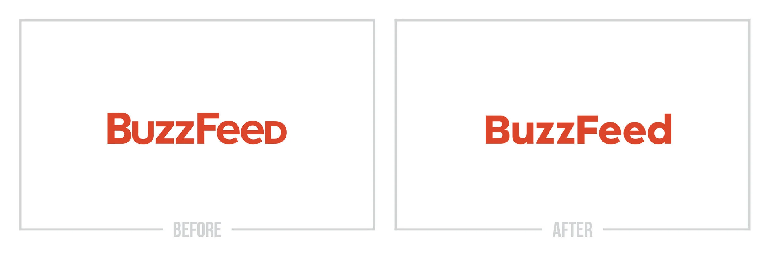
BUZZFEED
Once masters of clickbait and gimmicky posts, BuzzFeed, over the years, has transitioned into one of the largest media companies in the world. While they still post top 10 cute cat lists, recipe videos, and over the top opinion articles, BuzzFeed created a division called BuzzFeed News that has broken some of the largest stories of our generation. Seemingly the voice of millennials BuzzFeed and BuzzFeed News are heavy hitters. This is the perfect example of routine maintenance in a logo. You could easily argue that either logo is perfectly fine, but transitioning into this bolder, cleaner typeface seems to emulate the company's values as they become a digital conglomerate.

BRISTOL CITY
As I said above in the introduction to this article, one of the most challenging things when going through the rebranding process is deciding that you need a rebrand. No matter what your old logo looks like, you'll always feel attached to it as there is some form of history behind it, and it got you to where you are now. That said, sometimes we need to move on from the past and embrace the future. Bristol City did just this as they ditched the traditional crest style logo that soccer teams around the world are known for and entered the pitch with a new mark that visually takes them from pretender to contender.

VITA COCO
Last but not least, on this list is Vita Coco. If you were to look at all of the rebrands that have taken place decade by decade, you would see that simplicity was king. An excellent example of this is Apple. What started as a highly intricate mark was chipped down over the years into a unique iconic look. Not to say that this coconut water company is doing something so intense but, removing the palm tree and the stylized coconuts from their logo is the perfect example of a modern-day rebrand. They didn't rewrite the company's story or radically change to a shocking new color or look. They just took their current mark and modernized it. Something so simple goes such a long way, especially on the shelf, where they are up against literally hundreds of other options that sit right next to them behind those refrigerator doors — having the guts to be bold paid off. The next time you go to grab a drink from the convenience store, take a look at their packaging, and you'll see that it almost leaps out in comparison to everything around it.

I hope that this blog post was an excellent introduction to what a rebrand should be and how to approach one for yourself. As I mentioned above, you don't always need to rework the wheel; sometimes, it just needs a little polish.
Does your brand need a new logo? Let’s talk about creating a one-of-a-kind logo for your brand!