The 10 Worst Logos of 2019

As with every year, towards its end, we begin to reflect on everything that happened. Logos are no exception to this rule. 2019 was a year that saw the comeback of flat design with touches of realism, the normalization of animated logos, and a strong resurgence of eclectic design.
Let's take a moment to look back at some of the Worst Logos of 2019 (in no specific order) and learn what makes them tick.

BASECAMP
Basecamp is a wonderful tool for keeping large teams organized. It helps keep track of everything, from tasks to timing. Their old logo and stylization had consistently been a playful yet organized topographic based experience. With their recent rebrand, they not only ditched the charm the brand was known for but created a generic mark that fails to convey what the business is and who it serves.
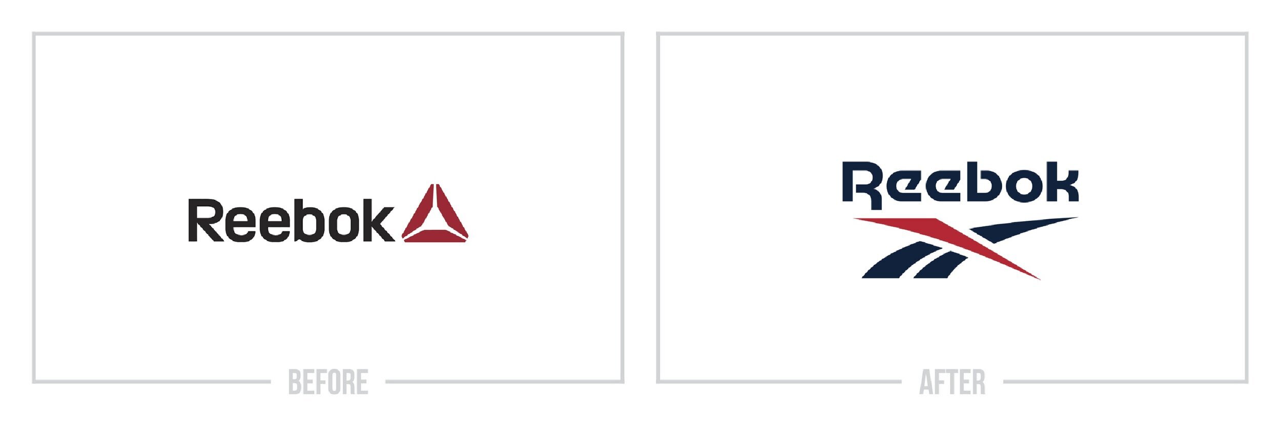
REEBOK
In what can only be described as going back to the future, Reebok ditched their recent rebrand that separated themselves from their competitors and fell back into an older mark. While several minor tweaks were made to the new logo, it feels the same as the late 90's logo that you saw slapped on every track jacket. For a brand that's trying to integrate itself with newer ideals, this feels like a swing and a miss.

STAPLES
While everyone has their definition of iconic, I would certainly argue that the original Staples logo was within that territory. The hinge in staple forming the L was the old marks only defining feature. The new Staples mark with the unhinged staple and modern typography is a treat for the eyes, but it feels like an overall disconnect from what the brand is a no-frills supply company.

SAM’S CLUB
Here is an example of going from bad to worse. The old Sam's Club logo was nothing unique by far. But, the new Sam's Club logo feels more generic and bland than its predecessor. As a company that offers such a unique array of products, a logo with a little more life to it would certainly be welcome.

AVON
Sold by moms around the world, Avon is no longer the staple it once was in the 90's. While it still maintains a very dedicated fan base. The refreshed look with the tilted "O" seems very forced and cliche. The old mark was a simple nod to the Avante Garde style and was exemplary of the luxurious feeling Avon was trying to convey. This bold new direction feels off-brand.

VOLKSWAGEN
A company born out of a very dark piece of history has done an excellent job branding itself over the years and even overcoming numerous industrywide scandals. For almost 50 years, the Volkswagen "VW" logo has stayed the same. Gone are the relics and markings of its past. With the newest logo, Volkswagen is attempting to hop on the now-aging flat design trend. Comparing this new mark to the industry, it feels lackluster, and instead of breathing new life into a brand, they're left with a flat tire.

CHICAGO FIRE FC
Not since the rebrand of the Seattle Seahawks secondary logo in 2017 have I seen so much hatred come for a professional sports logo. While it was never a catchy mark, the rebrand of the Chicago Fire FC's logo was one that missed the mark. Not only did the logo lose its soul, the seemingly random changes completely ignored the brand's heritage and the city it represents.

PAPA JOHN’S
After a massive scandal with the founder of Papa John's, they did a nationwide, goodwill marketing campaign followed with a rebrand to refresh the narrative around the company. While the new logo is an improvement to the old one when you look at companies like Pizza Hut and Domino's that have went all-in on design, you can see that Papa John's is being left in the dust.

HULL CITY
A logo that induces cringe to designers everywhere, Hull City's badge has been around for over a century. So, when in 2019, they decided to rebrand, it was a big deal. What came out was a logo that played it safe. Only reshaping the badge and adding Hull City to the top of the mark not much changes. While the tiger in the middle of the mark was lightly touched up, it remains seemingly unchanged. Like so many other sports brands as of late, the unwillingness to embrace a team's heritage or explore a new route leaves us with another run of the mill experience.

THE ATLANTIC
Last but not least, we have The Atlantic. Known for beautiful editorial pieces and consistently great design, The Atlantic has always held a glimmer in the eyes of designers and readers alike. That's why their rebrand came as a shock to many. Ditching the italic, treated font of the past, The Atlantic's new logo looks like a pressroom intern was given 30 minutes on Microsoft Word to create a new logo. It's always a sad moment in the industry when you see a beloved design meet the maker, and we can only hope that the original mark makes its return someday.

So, you made it through the 10 Worst Logos of 2019. I hope you found the article useful and that you even learned a bit about design itself. Want to avoid a tragedy like one of the marks above? Hiring a freelance graphic designer like myself, who is well-versed in branding and marketing, can help you find the best identity for your brand.
Does your brand need a new logo? Let’s talk about creating a one-of-a-kind logo for your brand!