The 25 Worst Logos of 2023

Today, we're taking a look at "The 25 Worst Logos of 2023". In this review, we'll examine 25 logos that visually fell short this year. These will serve as examples of what to avoid in logo design. As we analyze these logos, we'll uncover design missteps and branding blunders; providing insights to ensure your brand steers clear of these pitfalls. Join us as we explore where these logos went wrong and what you can do to avoid their mistakes.

#1 - Nokia
Why It Made The List:
The negative space in the typography leads to a lack of legibility.
The rebrand was intended to distance itself from the mobile phone industry, but is so vanilla it ends up saying nothing.
Thin lettering and updated font leave no historical nod to the former mark.

#2 - Rooster Teeth
Why It Made The List:
The loss of iconography leaves this logo feeling bland.
A comical font with mixed case lettering is a step backward.
Having a logo that is so dramatically horizontal can lead to production problems down the road.

#3 - Android
Why It Made The List:
An odd step back in time. The android icon ditched the legible flat design and added colored eyes that can stop the piece from being reproduced in a single-color format.
The font change, though more mechanical and robotic, is kerned too tightly and feels unrefined compared to the previous font.
A thickened Android itself is welcome, but as a whole, this rebrand is not an upgrade.

#4 - Slurpee
Why It Made The List:
The Before logo was iconic, legible, and bold. The After logo looks like a student project.
Including the ® as a piece of the mark itself is an interesting concept; but it is done so boldly that it throws off the weight of the logo itself leaving it unbalanced.
The new “S” looks less like the top of a Slurpee and more like what comes after.

#5 - Facebook
Why It Made The List:
We’ve seen this one before: from “F” to “F” in a square, and back and forth. Over the years, Facebook has played around with its mark so much that it has flooded the visual market.
With so many versions of its mark, businesses trying to communicate that they are on the platform are left confused as to which icon is correct.
The Facebook “F” does not match the “F” used in Facebook’s logotype, creating further confusion.

#6 - MiLB
Why It Made The List:
The After logo is now too similar to the MLB logo. In an attempt to align the brands, it causes marketplace confusion.
Now at bat; more of the same. A near 1:1 copy of the MLB logo feels like a minor-league move.
The mark should have signified the AAA, AA, and A levels of baseball and not the four levels of baseball including the MLB since that is a separate entity.

#7 - Seattle Sounders FC
Why It Made The List:
Not including your team’s name in its primary mark is a miss.
While the mark itself is strikingly beautiful, it in no way signifies that it belongs to a sports team.
The outer rim’s color change is so subtle that it’s barely noticeable.

#8 - Johnson & Johnson
Why It Made The List:
A useful rebrand, but a boring one. While legibility is improved, it is so bland to account for the network of brands under Johnson & Johnson that it plays it safe.
Such a vanilla approach gets the job done but lacks a voice.
Having a logo that is so dramatically horizontal can lead to production problems down the road.

#9 - Tennis Australia
Why It Made The List:
A nearly invisible “A” created via a gradient creates a mark that struggles to be reproduced in a single-color format.
A “t” moonlighting as an uppercase and an “i” without a dot, also known as a tittle, just looks off.
With the exception of a barely legible “A”, there is nothing else indicating that this is Australia’s tennis league.

#10 - Opel
Why It Made The List:
In a move to “focus on electric”, why not rotate the bolt 90 degrees?
While the strokes add welcome negative space to break the logo apart, having them be uneven widths feels random.
All in all the Before and After are so similar that the change may cause market confusion.

#11 - National History Museum
Why It Made The List:
The After icon feels more like a high school project than modern art.
While neither piece tells the brand’s story properly, the After is just one icon away from a strong rebrand.
The logo fails to inform us of the museum's location.

#12 - ZOHO
Why It Made The List:
For a company at the forefront of corporate technology, the After mark is profoundly disconnected from its user base.
The After’s typography is so small compared to the iconography that it feels dwarfed.
A total disconnect from the product leaves this rebrand feeling dead on arrival.

#13 - Thunderbird
Why It Made The List:
Similar to the "Facebook Syndrome," these logos undergo continuous style changes without any meaningful reasoning behind them besides restyling.
The icon remains mismatched from its sister brand, Firefox; as one has eyes, they feature opposing colors, and so on.
Although it is an app icon, it still lacks any identifiers that connect it to the brand name.

#14 - Nordstrom Rack
Why It Made The List:
From fashion-forward to fashion fail. That rack just isn't right.
In an attempt to appeal to a millennial audience, Nordstrom Rack goes a bit too far in its efforts to modernize, ultimately isolating customers both young and old.
The bold new branding and colors across the entire site feel more like a flash sale than high fashion.

#15 - Visit Pittsburgh
Why It Made The List:
Breaking up “Pittsburgh” in the design feels disrespectful to the city.
The random orientation of the squares below, with no geographical emphasis or appreciation of steel, creates a sense of disconnect.
Using a logotype for a visual destination proves to be a lackluster solution.
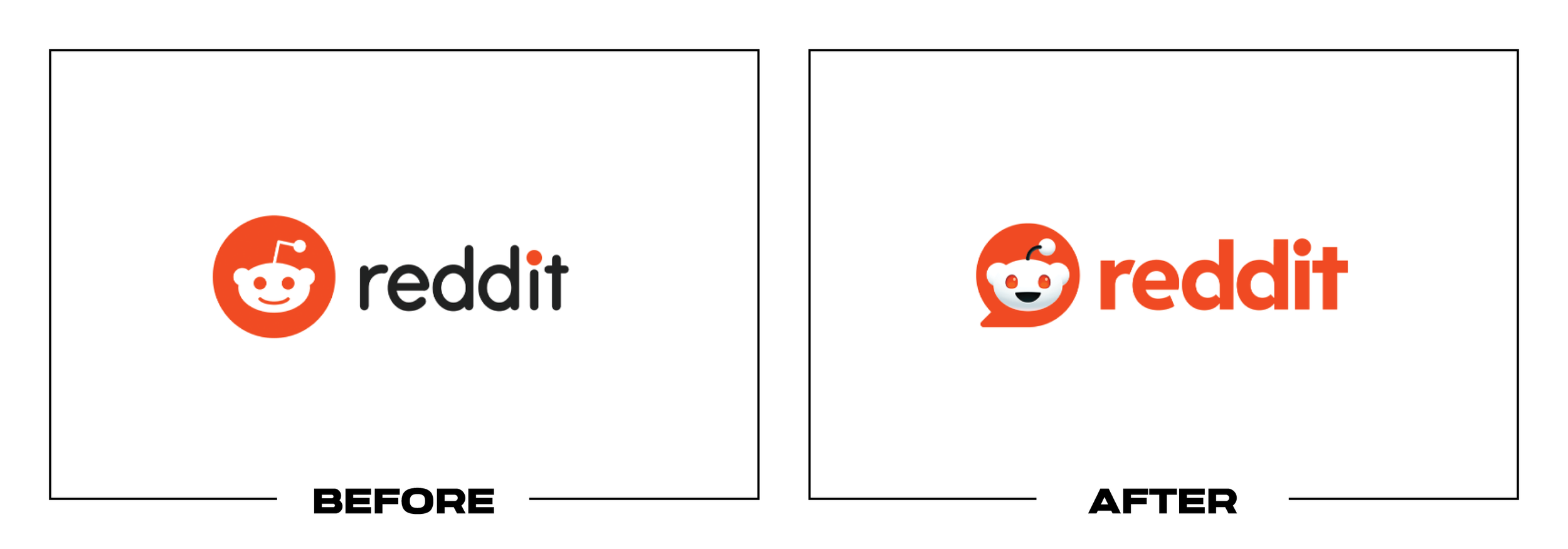
#16 - Reddit
Why It Made The List:
Amidst years of leadership scandal, this rebrand was meant to signify its speculated IPO launch. From the new font to the new avatar, the entire rebrand seems comical.
An all-orange After results in a lack of contrast.
Double bubbles create toil and trouble in terms of legibility for our After.

#17 - Burberry
Why It Made The List:
One flavorless berry. The intricate detailing in the logo may be lost at smaller scales, affecting its visibility and recognition.
The new wordmark could have been more consistent with the rest of the brand, potentially incorporating elements from the logo (not shown here) into the wordmark for better cohesion.
Burberry, like other fashion brands, adopted a minimalistic approach similar to Chanel, losing distinctive characteristics and becoming vanilla.

#18 - Linksys
Why It Made The List:
The After’s monogram is an attempt to be a Wi-Fi symbol but reads as “LLinksys” with the “i” being almost illegible.
Like a router, this has brought the internet together with the rebrand receiving major backlash online.
While both marks were difficult to decipher, our After may be my nominee for worst of the year for its lack of clarity, especially since the Before had a similar problem and offered a cautionary tale.

#19 - SiriusXM
Why It Made The List:
The star, though a clever nod to satellite radio, creates a nearly illegible "S".
The loss of wavelengths feels like a miss.
A single-tone colorway leaves this logo feeling like radio static.

#20 - Made For Med
Why It Made The List:
It’s a great joke but, possibly the most illegible logo of all time.
In the healthcare industry, it will certainly be memorable, but outside of that…?
Inside baseball aside, the logo cannot scale. Additionally, having a logo that is so dramatically horizontal can lead to production problems down the road.

#21 - Patreon
Why It Made The List:
A formless and indistinct identity that struggles to be a “P”.
The logo's ever-changing design, while meant to reflect the platform's evolution, raises questions about the reflectiveness of the brand itself with the “P” meant to be filled with imagery.
The minimalistic approach is an effort to appear contemporary, resulting in a vague and uninspired rebrand.

#22 - Microsoft Copilot
Why It Made The List:
Yes, there are now two products named Microsoft Copilot.
This logo resembles what I would call a Shutterstock logo: it’s visually appealing but lacks a narrative, consisting merely of symmetrically folded lines and colors.
Considering the already established ecosystem (Microsoft Office), why not brand the product similarly and visually hint at what the product is, perhaps through a logotype that displays its name?

#23 - Komero
Why It Made The List:
Rebrand or jigsaw puzzle? You be the judge.
If you're unfamiliar with the brand, you might struggle to determine the correct order to read the logo in.
The elimination of all iconography transforms this from a distinctive food brand to something rather bland.

#24 - OMSI
Why It Made The List:
An attempt at being explorative ends up resembling clip art.
It's a missed opportunity to include local geography or iconography.
The museum's name is overshadowed by the acronym, rendering it nearly illegible.

#25 - Jaguar Land Rover
Why It Made The List:
The new Jaguar Land Rover logo epitomizes corporate blandness, lacking any story, flavor, or flair, and effectively diminishes the distinctiveness of both brands.
There's confusion in the marketplace regarding whether this logo will be used on new vehicles or at dealerships.
The rebranding feels more akin to a nondescript legal firm's logo than that of an automotive conglomerate.
Thank you for exploring "The Worst Logos of 2023" with us. If this has prompted a rethink of your brand's logo, seize the moment. Elevate your brand with a distinctive logo that stands out and speaks volumes. At Parker Lee Creative, we're committed to crafting logos that not only avoid the pitfalls of bad design but also captivate and engage. Let's collaborate to make your logo a beacon of your brand's excellence.