The 25 Best Logos of 2023

Today, we'll embark on an exciting exploration of "The 25 Best Logos of 2023". Join us as we showcase 25 logos that represent the pinnacle of creativity and branding excellence this year. These logos are not just visually stunning; they tell compelling stories and set new benchmarks in design. As we dive into this showcase, prepare to be inspired by the innovation and artistry that make these logos stand out in the world of branding.
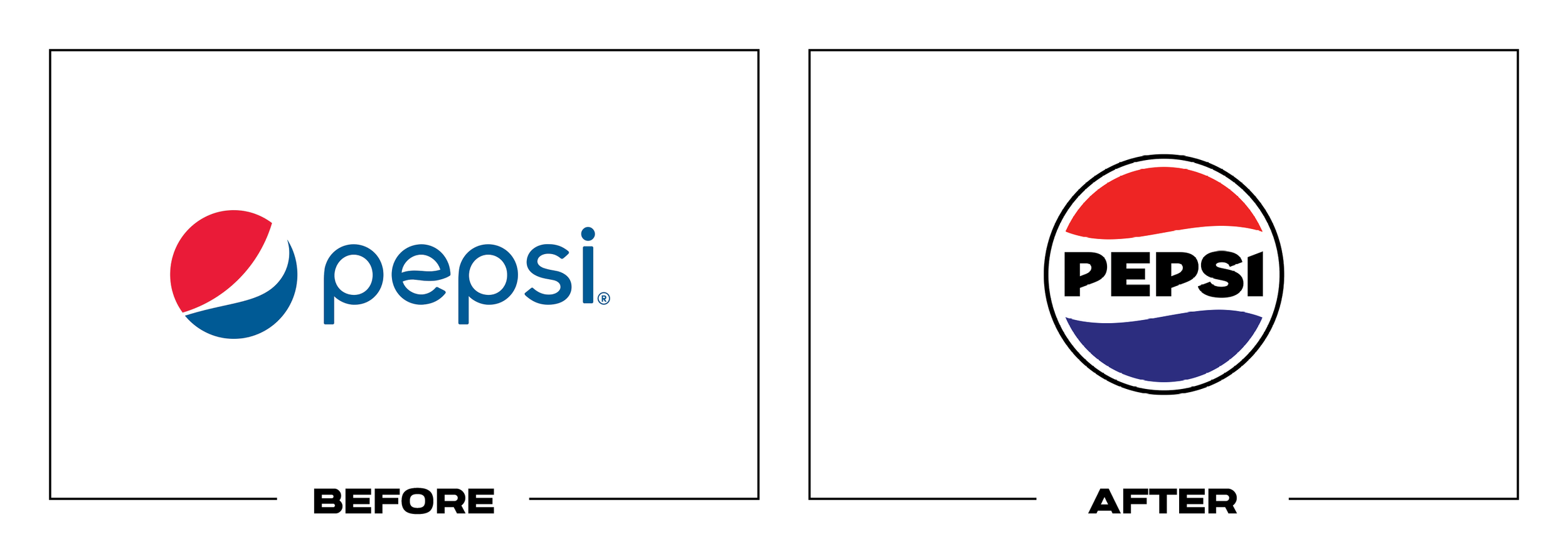
#1 - Pepsi
Why It Made The List:
Talk about a glow-up! This bold rebrand embraces the retro and does it loudly.
Switching from a thin type to a thick, slab sans-serif type that is highly legible is a refreshing change - no pun intended.
It's great to see symmetry introduced in the After.

#2 - Bit•O•Honey
Why It Made The List:
The typography here is deliciously appealing. The honey droplets add a delightful sweetness.
Transitioning from a busy mark to this logo enhances its reproducibility across all mediums, both physical and digital.
The only element that could enhance the After further is a splash of color.

#3 - Eddie Bauer
Why It Made The List:
Moving on from their signature look and into the future, the new Eddie Bauer feels fresh as a morning walk.
Adding iconography feels like the exact opposite of what the fashion brands in our “Worst” articles have done by going vanilla and sticking to logotypes to play it safe.
As part of a rugged, centennial rebrand, they’ve embraced the outdoors, and it works.

#4 - Bolthouse Farms
Why It Made The List:
We LOVE to see clean hand-lettering; add in a dash of iconography, and you’ve got something special!
Along with refreshed packaging that allows the logo to stand out brightly against dark juice, they really squeeze every drop out of this truly fresh rebrand.
Scalable beauty. It’s not often that scripts remain legible both big and small, but this design nailed it.

#5 - Propel
Why It Made The List:
Truly one of my favorite rebrands this year. This is how you give a nod to a mother brand.
This is a good example of less being more. We’ve spoken about minimalism going too far in our “worst” article, but here, it's executed to perfection.
The tasteful branding of the ® doesn't feel too heavy, thanks to the angle of the logo.

#6 - Indiana
Why It Made The List:
Leaving behind the angular Before and returning to a traditional logotype shows a measured approach.
The inclusion of the state in the After's negative space is a wonderful touch.
Tourism logos are often pretty bland, but the CTA within the logotype is a win.

#7 - U.S. Army
Why It Made The List:
Bold, scalable lettering that clearly says “military”.
Moving away from the multi-stroke look and opting for a clean, legible mark that is reproducible across both digital and physical mediums is a major win.
The thick stroke on the logo allows it to stand alone as a secondary logo.

#8 - Davidson College
Why It Made The List:
From thin and barely visible to loud and legible.
The addition of a monogram and typographic hierarchy enables the logo to be broken down into primary, secondary, and tertiary versions, allowing for adaptability in various situations.
Introducing contrasting colors adds a collegiate feel while maintaining refinement.

#9 - Zevia
Why It Made The List:
Refined typography significantly elevates this logo. Comparing the Before and After, the After's symmetry and refined appearance almost transform Zevia into a new brand.
The use of a dark green palette, in conjunction with the brand’s industry, shifts its image from "store brand" to "luxury brand".
The symmetry in the lettering and the subtle leaf in the “v” are thoughtful nods to the brand’s health-conscious tone.

#10 - Fanta
Why It Made The List:
Legibility receives a significant boost with the shift from a loose script to a stroked sans-serif, which, due to the stroke, remains legible on any background.
The removal of the orange color and branding results in a versatile, flavor-neutral logo adaptable to various products without causing confusion.
The adoption of a chiseled, angular style imparts a sense of forced perspective, giving the impression that the logo is in motion.

#11 - Oregon Zoo
Why It Made The List:
The vibrant colors in the rebrand make the After as lively as its animal residents.
The use of large iconography ensures the logo's recognizability from a distance and allows it to scale down effectively for smaller applications, like stitching.
Eliminating the dual-sized type creates a more welcoming appearance.
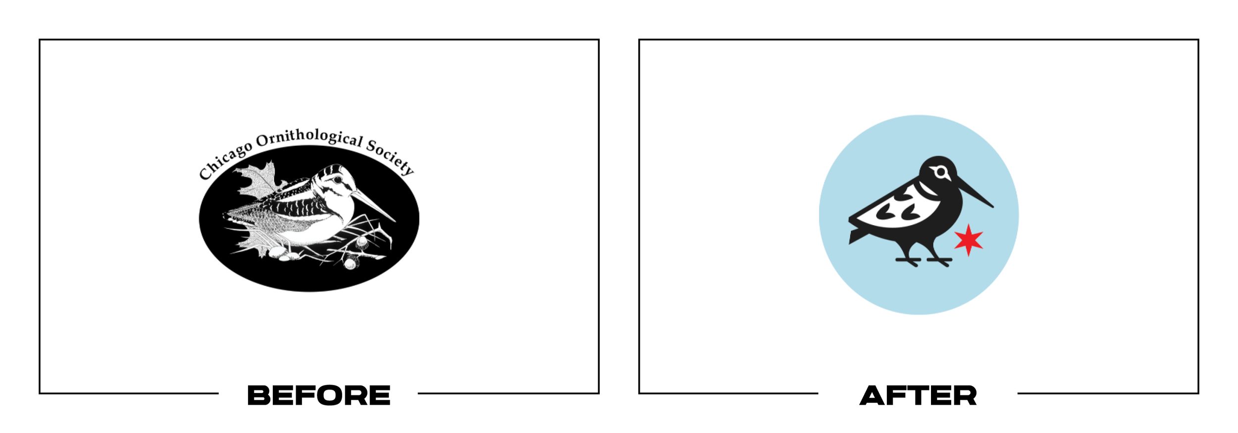
#12 - Chicago Ornithological Society
Why It Made The List:
A 1:1 ratio logo is more social media and profile picture-friendly.
Incorporating Chicago’s city flag helps eliminate the need for the brand’s lengthy name in the logo itself.
Transitioning from a carved wood block style to a modern, minimal vector makes the logo more discernible.

#13 - Tai Pei
Why It Made The List:
Pump it up! The scaling up of elements for enhanced legibility is set to make a significant impact on store shelves.
Softer curves and a font without a traced stroke improve the logo's legibility.
The modifications result in a friendlier, more youthful, and approachable brand image.

#14 - Temple
Why It Made The List:
What is a college logo without its mascot? The After finally corrects this by giving the Temple Owls their much-deserved wings.
The new After enables the logo to be divided into primary and secondary versions.
The new logo embodies a collegiate spirit; the badge design is particularly well-suited for athletic uniforms.

#15 - Industrial Light & Magic
Why It Made The List:
This After truly shines bright! The modernized typography enhances scalable legibility and aptly showcases the magic behind the work.
Opting for boldness gives the logo substantial weight, reflecting the true stature of this industry giant.
It's corporate magic. Striking a balance between whimsy and professionalism is challenging, but here it's executed to perfection.

#16 - Stella Artois
Why It Made The List:
The Stella Artois logo, dating back to 1366, is one of the world's oldest. Witnessing one of its revisions highlights the necessity for logos and brands to evolve.
The rebrand replaces strokes and hard edges with negative space and a flat design, moving away from a woodcut effect towards a modern style.
Refining all lettering to enhance legibility and scalability greatly benefits this rebrand, making the After feel like a completely new brand in the best possible way.

#17 - Philharmonie Luxembourg
Why It Made The List:
There's so much to admire here, beginning with the inclusion of the full brand name.
The building itself, transformed into an icon, features an audio-responsive wave that varies based on the performances inside.
This rebrand also introduces a suite of brand elements and musical-themed typography for advertising purposes.

#18 - 1Password
Why It Made The List:
Emphasizing serious security, the shift from a cartoonish lock to a sleek, all-black design signals a more professional, business-like approach.
Achieving a universal typographic line height adds a layer of professionalism to the typography.
The principle of 'less is more' is effectively embraced here, making minimalism particularly fitting for a security brand.

#19 - Minute Maid
Why It Made The List:
The juice is loose! Eliminating the greenery from the logo allows it to sit cleanly on any of the transparent bottles, enhancing its visibility on the packaging and ensuring cohesive matching across different fruit varieties.
The revised typography in the After is significantly more approachable and inviting.
By increasing the overall scale and reimagining the top to resemble a rolling field, the design strongly reconnects with the brand’s agricultural roots. (No pun intended.)

#20 - Cigna
Why It Made The List:
Transitioning from a generic name to a clearly defined brand, Cigna emphasizes that clarity equates to quality.
Replacing the “stock photo logo” with a more relaxed, natural-looking After, which is a comforting approach for an insurance company to take towards its guarantors.
Bidding farewell to the default font in favor of a more refined and personality-rich font choice.

#21 - SlimFast
Why It Made The List:
The inclusion of a built-in background enables the logo to stand out prominently on any background, whether reversed or not.
Abandoning the angled design enhances legibility at first glance and imparts a more relaxed, professional vibe.
The "tab" appearance of the After is designed to resemble an endorsement, fitting for a brand transitioning into a lifestyle image and expanding beyond shakes to feature on a wider range of packaging.

#22 - 7up
Why It Made The List:
Dropping the stroke enables the logo to stand out on a wider variety of surfaces and mediums, and to reverse out more easily.
The new packaging is more eye-catching on the shelf. Brighter and bolder color swatches create a striking shelf presence.
Bigger is indeed better. With the logo's unique size, it can occupy substantially more space on the packaging, and this rebrand fully leverages that advantage.

#23 - Squier
Why It Made The List:
Thinning out the script and carefully kerning the script font, a challenging task, significantly enhances the logotype's legibility.
Abandoning the slight angle aligns the logo more closely with its parent brand, Fender.
The smooth curves in the redesign modernize the brand, transitioning it from a 90s style to a contemporary 21st-century look.

#24 - Western Union
Why It Made The List:
Reintroducing the iconic yellow gives the mark much-needed contrast, drawing attention to the logo.
The subtle incorporation of the "U" within the "W" creates a striking monogram.
Enhanced legibility is achieved by moving away from the chiseled “s” and “i”, resulting in a more readable After.

#25 - Stir
Why It Made The List:
Brands that weave meaning into their logo not only showcase their creativity but also demonstrate the extra effort put into their product across the board.
Alluding to your product's purpose with a visual aid is a smart strategy, as it helps people quickly understand what you offer.
Using a bold color is an effective method to ensure your product stands out on the shelf.
Thank you for joining our journey through "The Best Logos of 2023". Inspired to forge a unique identity for your brand? Let’s craft a logo that not only tells your story but sets your business up for success. Together we can transform your vision into a memorable and engaging logo that resonates with your audience.