The Worst Logos of 2022

Welcome to our blog about the Worst Logos of 2022! In this post, we will be taking a critical look at some of the most poorly designed logos from the past year. From awkward font choices to uninspired iconography, these logos are the epitome of bad design.
But why are we focusing on the Worst Logos of 2022, you might ask? Well, as a branding expert, I believe that it is important to not only highlight the worst work in my field but also to critique and learn from the mistakes of others. By examining the Worst Logos of 2022, we can identify common pitfalls and avoid making the same mistakes in our own work.
Additionally, this blog post is a great resource for anyone looking to avoid bad logo design. By showcasing the Worst Logos of 2022, I hope to provide valuable lessons and insights for creatives and businesses alike.
So without further ado, let's dive into the Worst Logos of 2022!
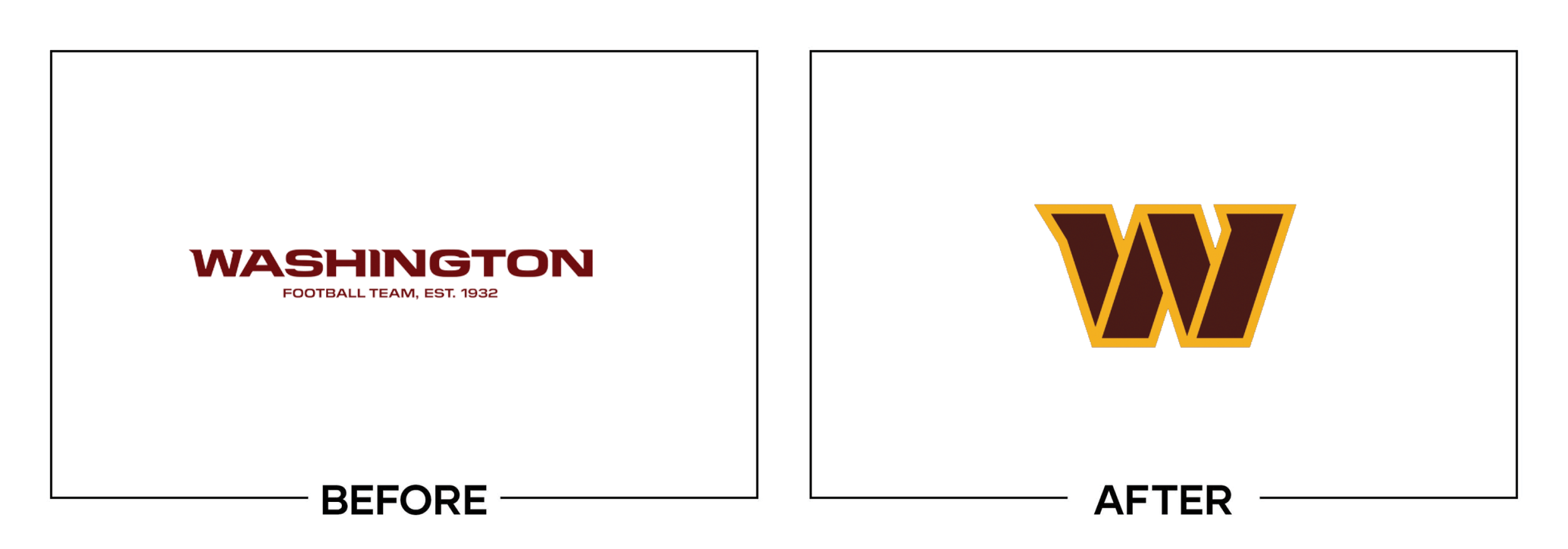
Washington Football Team
Why It Made The List:
For those counting, this is Washington's second rebrand in as many years.
With an absolute lack of any supporting iconography, this logo sets its team up for another L.
The lack of a mascot or icon takes all emotion out of a sports team's overall branding.

Powerbar
Why It Made The List:
The horizontal lines create illegibility and make the logo difficult to recreate on physical mediums like embroidery.
A lack of iconography takes the like out of this old logo
While the old logo had challenges going into a one-color format this new logo is void of all personality.

The Verge
Why It Made The List:
While this logo is specifically created for digital use, it feels out of place outside of it's intended use case on the site's homepage.
Trying too hard to be trendy and focusing on fashion over form hasn't done this mark any favors.
The new type treatment is barely legible at a quick glance.

Ortto
Why It Made The List:
Ditching a recognizable name and quality logo for a "buzzword" is such a step backward.
Allowing the "tt" to connect arms feels out of place with the rest of the logo spaced out.
While the new name is meant to stand for automation, they already had that covered.

Hootsuite
Why It Made The List:
From bad to worse, both the font and icon feel like an almost comical mismatch from one another.
The logo feels too juvenile for a multi-million dollar brand that has to market itself as an industry leader.
The new font's styling is a bit of a mismatch with the icon. The extreme curvatures on rounded letters are heavily contrasted with hard angles on straight letters.

Sprite
Why It Made The List:
This one might be a hot take as the internet seems to like this rebrand, but I feel like removing the "explosion" from the mark is a regression.
While the typography has seen notable improvements, the loss of the upward skewed angle and the aforementioned "explosion" take the soul out of this mark.
Overall, this is not a bad rebrand, but it is a wonderful example of how good intentions can have unintended results.

Buick
Why It Made The List:
The loss of the binding circle and upward progression of the "ribbons" removes any semblance of importance that this logo once had.
Following a trend we've seen other card brands follow in the past few years, the removal of a typical badge is an attempt to stand out, while in reality, it makes them blend in.
The negative space inside of the "ribbons" is not replicated on the actual car's badges leaving the logo feeling even more hollow in the real world.

Glaxo Smith Kline
Why It Made The List:
The old logo wasn't taking home any awards, but it was clean and legible on any background. The new mark may have trouble at smaller scales.
With a lack of iconography, GSK further embraces the generic corporate brand aesthetic.
The indents on the "G" and "S" feel forced almost as if the "K" already had one and they needed to find a way to tie the logo together.
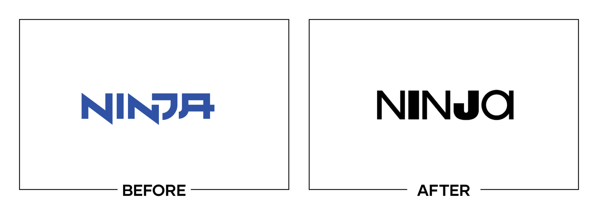
Ninja
Why It Made The List:
As a species, we must band together and stop using different weight fonts on individual letters in a word.
Once we've conquered restraint on random font weights, let's talk random capitalization. They "a" feels out of place.
Although cluttered, the old lettering felt sharp and gave a visual nod to the streamer's name. The new type feels lifeless.

Baskin Robbins
Why It Made The List:
Here's another hot take on an ice-cold brand. The new BR feels so heavily stylized that it skips past the old-time ice cream parlor vibe and lands in the uncanny valley of bad retro branding.
While they kept in the "31" and paid homage to the old logo. The new colors feel like they vibrate from one another and belong in two different projects.
The brand's tertiary color, baby blue further convolutes this rebrand. Now imagine this stacked into a Dunkin' / Baskin Robbins and you have half of the visible spectrum in one spot.
Here’s a sincere thank you for reading my annual Worst Logos of the Year article. It means a lot to me! Hopefully, you were able to take away a few lessons that you can apply to your brand.
Time for a new logo? Let’s talk about creating a one-of-a-kind logo for your brand!