The 10 Best Logos of 2021
Did you know time travel is possible? Come with me and we'll travel back in time and review The 10 Best Logos Of 2021.
As is tradition, I wanted to use this article as a set of exemplary tales and tips for businesses looking to change their look. Hopefully, we can learn from these rebrands and apply a lesson or two to our own work! With that in mind, let’s see The 10 Best Logos Of 2021 in no particular order.

KIA
Why It Made The List:
In an industry filled with drab and dated logos. KIA stands out like a beacon of hope!
The new logo elevates the brand voice to near elegant.
Ditching the badge helped this mark break away from the competition and embrace a radical mark that feels exciting.

MIDI
Why It Made The List:
The clean block type gives the MIDI logo a professional feeling.
The "M" is a subtle nod to sound waves and feels fluid.
MIDI decided to rebrand for whir 2.0 release which is the PERFECT time for a rebrand!
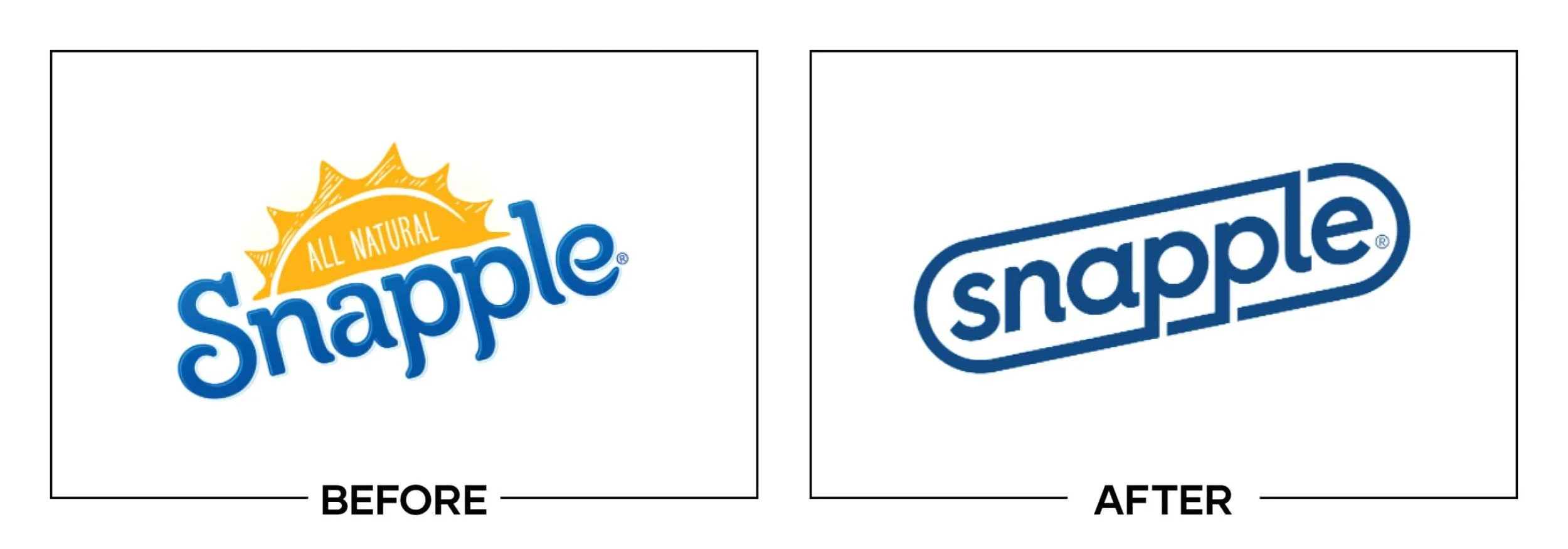
SNAPPLE
Why It Made The List:
This new mark is clean!
Moving from All-Natural to Naturally Flavored triggering the rebrand. From a consumer standpoint, this is a sneaky move, from the marketing side this is genius.
The in-store packaging is bright, bold, and fun. It just looks refreshing. Pun intended.

SEATTLE STORM
Why It Made The List:
I cannot get enough of this mark. It's minimal, scalable, and it tells a story. 10/10
One of my favorite sports rebrands in decades this mark feels like the gold standard for teams whose namesake comes from an inanimate object.
It only gets better. The one-color version of the mark feels aggressive in all the right ways!

SAN DIEGO ZOO WILDLIFE ALLIANCE
Why It Made The List:
Just look a the negative space in the icon. Perfection.
This new logo comes with a name change that is led by a positive organizational shift that focuses on the well-being of these animals.
The font feels alive. The tails on the "a" and "g" are stunning.

COLT 45
Why It Made The List:
A masterclass in simplicity, this logo now adapts to mediums where it once failed.
Despite being a bottom-shelf brand, this new logo feels top-shelf.
The switch to a one-color logo feels reminiscent of Miller's recent and very successful rebrand.

CHICAGO FIRE
Why It Made The List:
After a rebellion and fan outcry, the Fire ditched their old logo in less than a season.
This new mark is everything the fans wanted and is reminiscent of the city.
This feels like not just a top-tier, MLS logo, but a mark that rivals iconic European league crests.
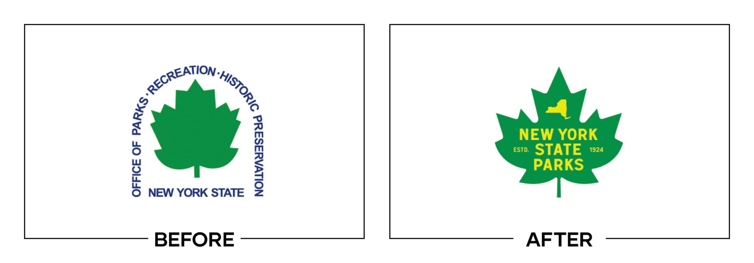
NEW YORK STATE PARKS
Why It Made The List:
If you looked up "modern outdoors logo" in a fictional logo only dictionary this would be THE result. This logo just feels good.
The warm, inviting aesthetic of this logo is reminiscent of what a parks department should be.
The leaf has been updated to match local foliage.

ABC
Why It Made The List:
Don't let the simple before and after fool you this is a major rebrand. Along with providing affiliate stations with new brand guidelines the new typography is much more eligible and scalable.
Spaced out! But scaling the lettering down and giving the letters some breathing room, this new log feels like an entirely different brand.
Removing a gradient that made the logo hard to read on some screens was a no-brainer and allows the logo to be replicated in one-color.

BURGER KING
Why It Made The List:
* chef’s kiss *
Embracing the old with a hint of modernization is the sweet (or is it savory) spot!
This King takes the crown for my favorite rebrand of 2021!

Thanks for reading my annual Best Logos of the Year article. It really means a lot to me!
Does your brand need a new logo? Let’s talk about creating a one-of-a-kind logo for your brand!